The Anti-Cliché: Rethinking Valentine’s
Every February, everything turns red.
Not just red. Loud red. Glossy pink. Hearts, roses, soft-focus glow. Or the other extreme, delicate pastels and dreamy haze. The visual landscape becomes a monoculture of crimson and pink. Decorative. Predictable. Safe.
I’ve always felt that a celebration as universal as Valentine’s Day deserves something more nuanced. Quieter. More grounded. More adult. The goal was simple: create a Valentine’s series without borrowing its aesthetic from the greeting card aisle.
I wasn’t interested in copying the symbols. I wanted to distill the feeling.
To me, Valentine’s Day is about anticipation. Intimacy. An evening that feels intentional.
The Parameters
I built the series around a few deliberate constraints.
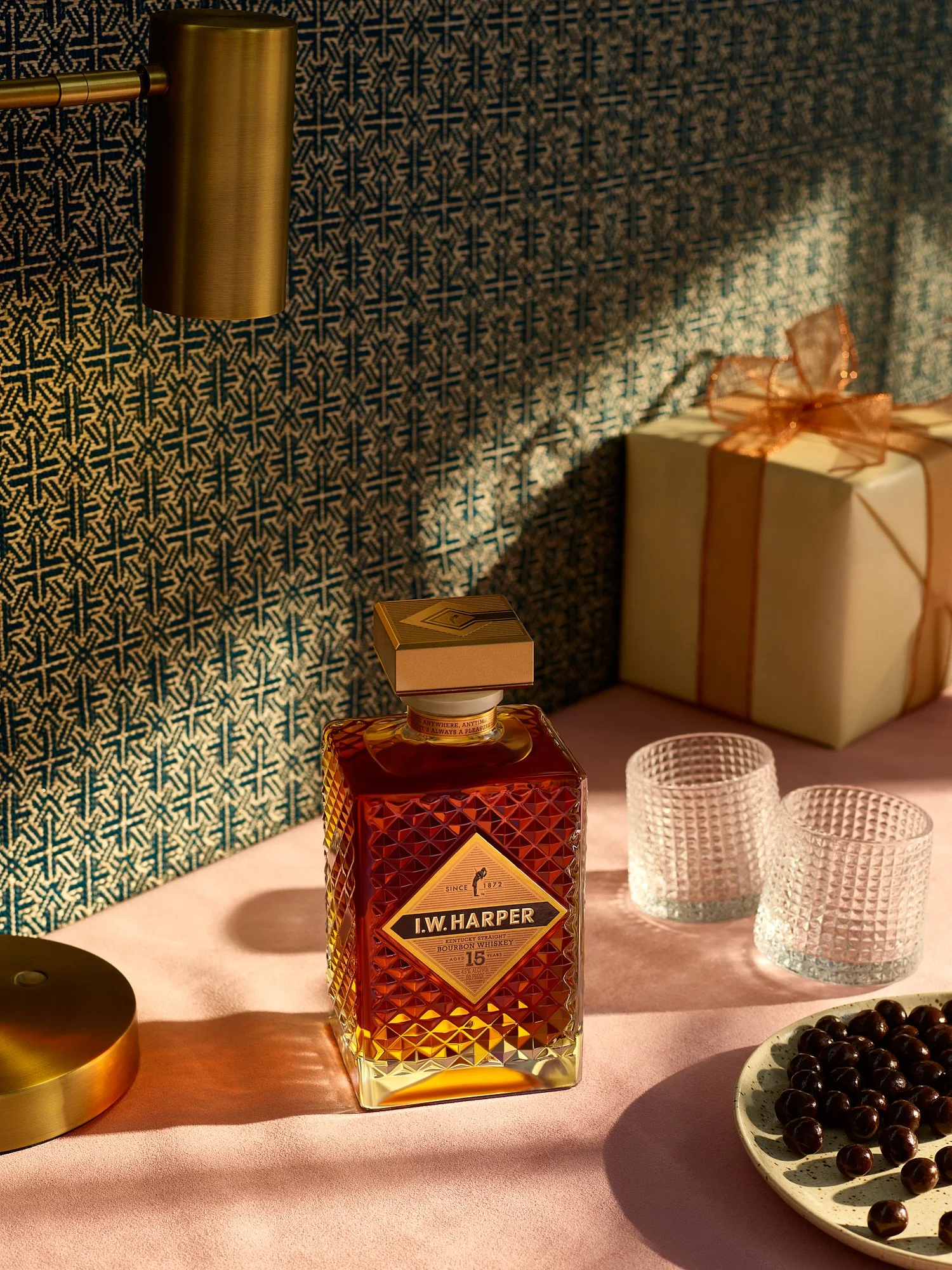
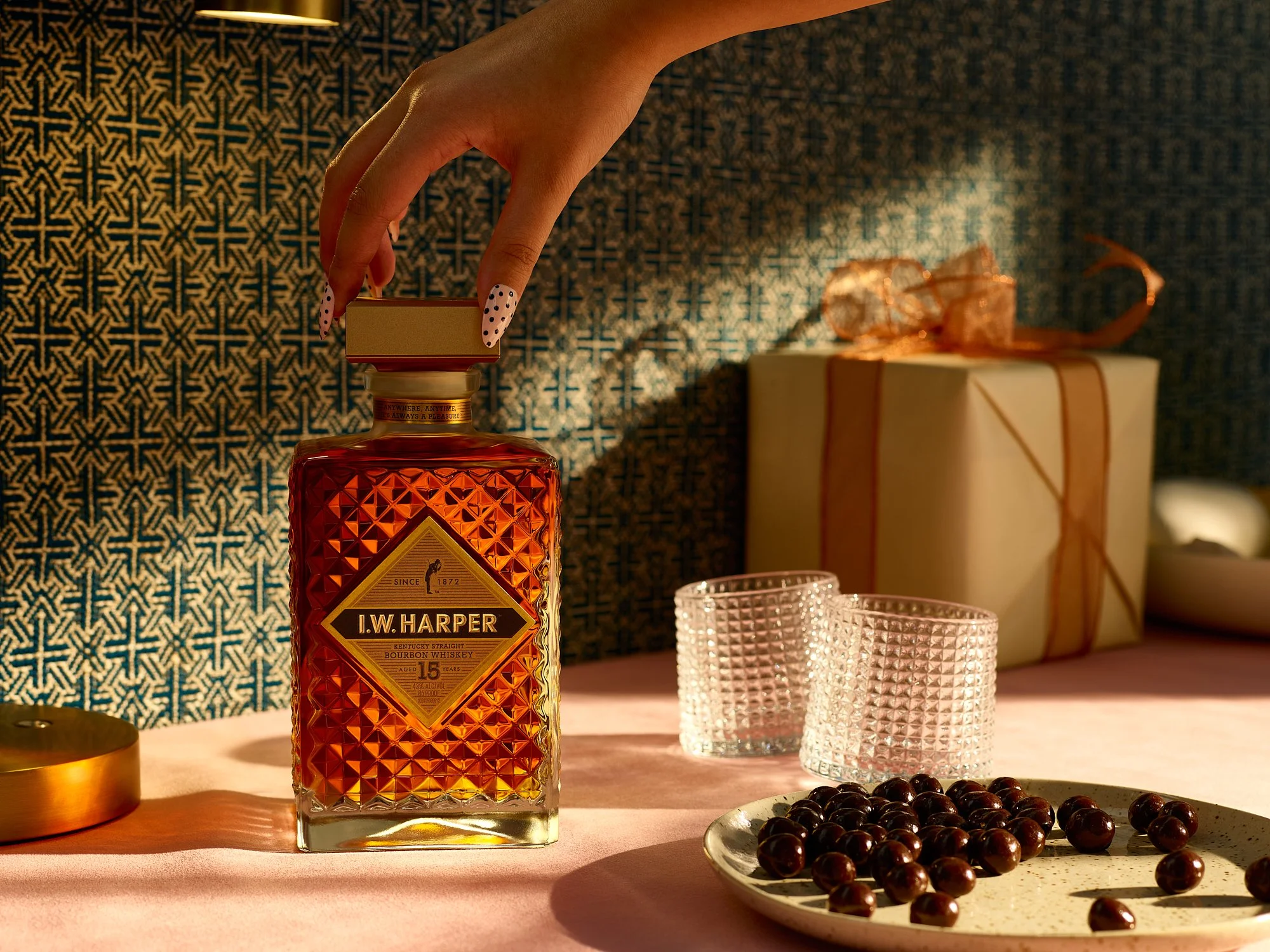
The light had to feel like a specific time of day. Directional. Intentional. Something closer to evening than holiday cheer. That shift alone changes the emotional tone from decorative to intimate.
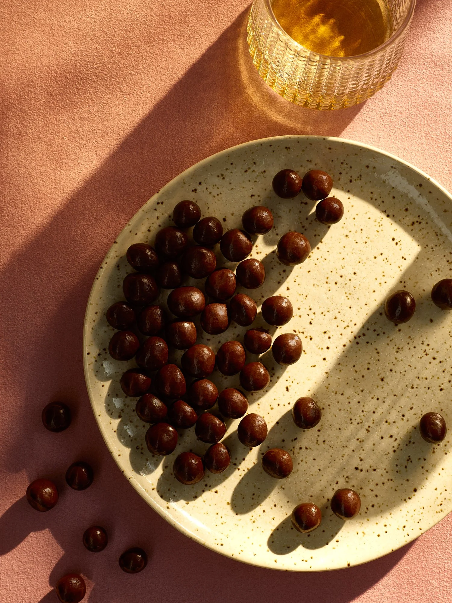
The palette needed to nod to Valentine’s without surrendering to it. Dusty rose, brass, gold, and a restrained blue for depth. Pink remained, but it was restrained and deliberate.
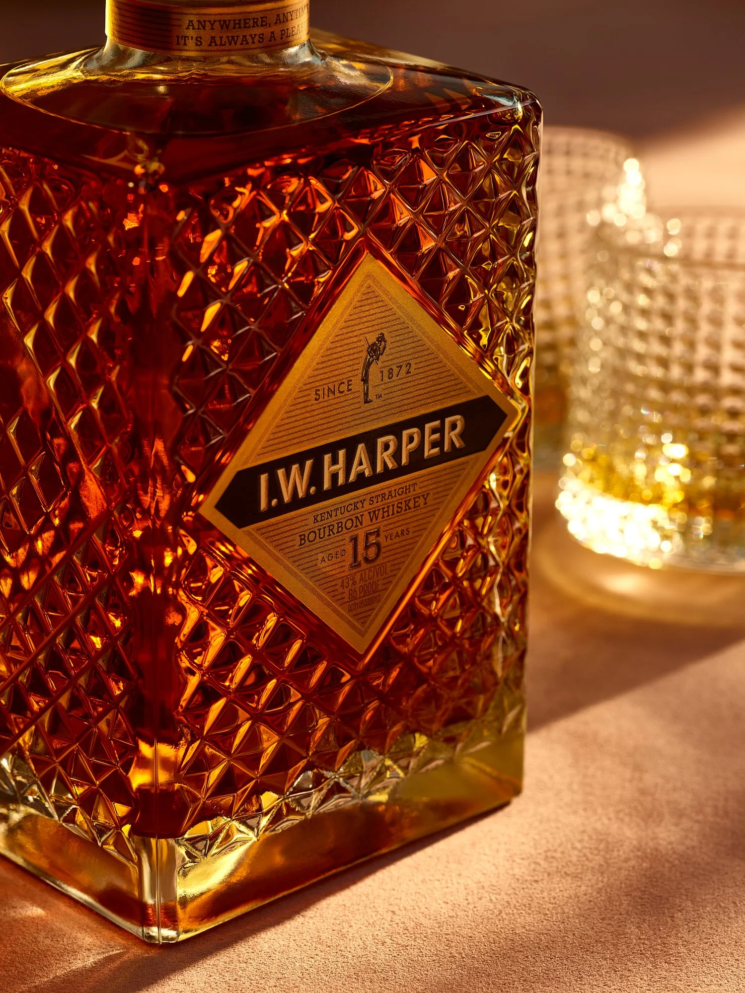
The subject was bourbon. Rare in the Valentine’s space, yet perfectly suited to it. Warm, ritualistic, and grounded. It reframes romance away from confection and toward experience.
And the texture mattered. No soft haze. I leaned into weight and material. Cut glass. Polished brass. Architectural shadow. I wanted the viewer to feel the room.


Overall, I wanted to move past the superficial and create something intimate. Strip away the cliché. Keep the emotional truth. Build from there.
When the focus shifts from symbols to story, the work outlasts the season. Seasonal food and beverage advertising photography by Dhanraj Emanuel, available nationwide for CPG brands, spirits companies, and advertising agencies seeking campaign imagery that breaks from category conventions.