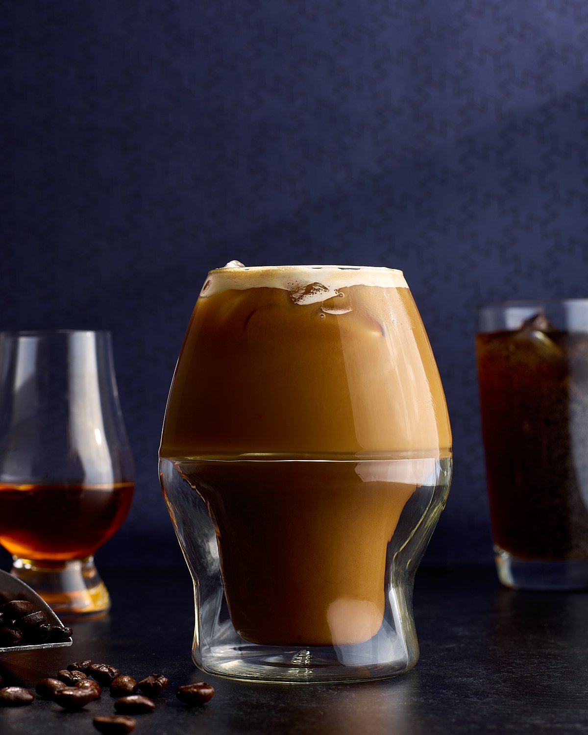
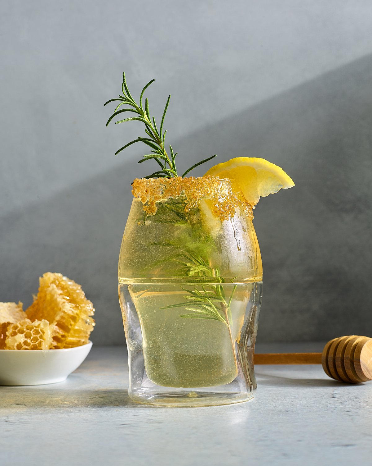
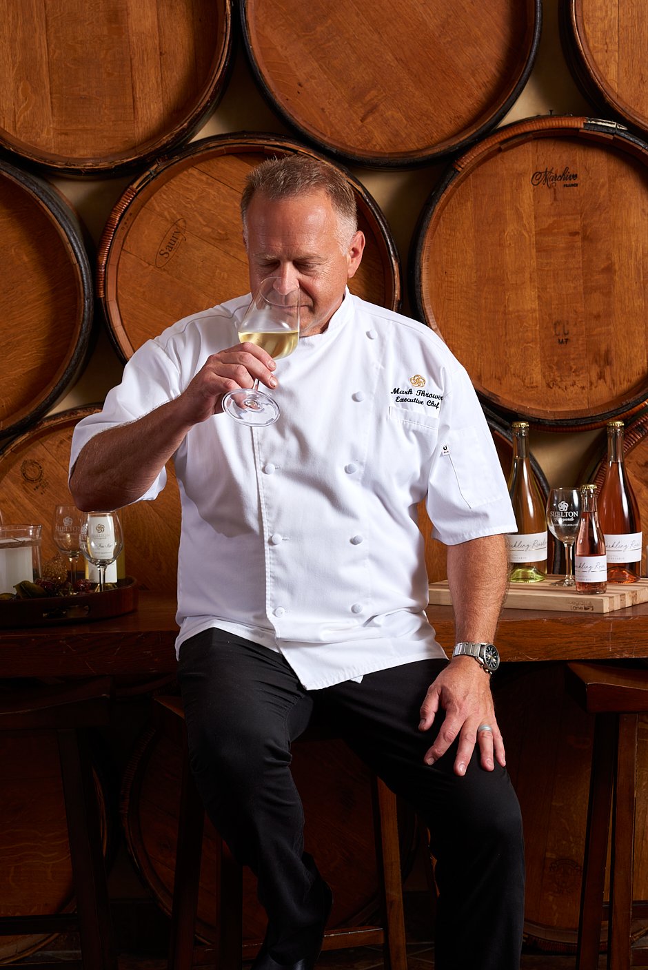
Hold That Thought
A monochromatic food series exploring what remains when contrast is removed — form, texture, shadow, and the quiet weight of light. Commercial food photography by Dhanraj Emanuel, available nationwide for advertising and editorial clients
On constraint, color, and holding still

The most impactful decisions usually come from a single thing I decide not to change.
In this series, I set a singular rule: hold the light, the surface, and the subject to the same monochromatic note. By removing the distraction of contrasting colors, the focus shifted to what remains. The architecture of form and the variety in texture, shadow, and the interaction of light on the surface.
An exploration of depth through discipline. A visual language where the subject carries the weight.
Dhanraj Emanuel is a food, beverage, and interiors photographer based in Greensboro, NC, working with advertising, editorial, and cookbook clients nationally. His work is built around a single principle: light builds the world the subject lives in.

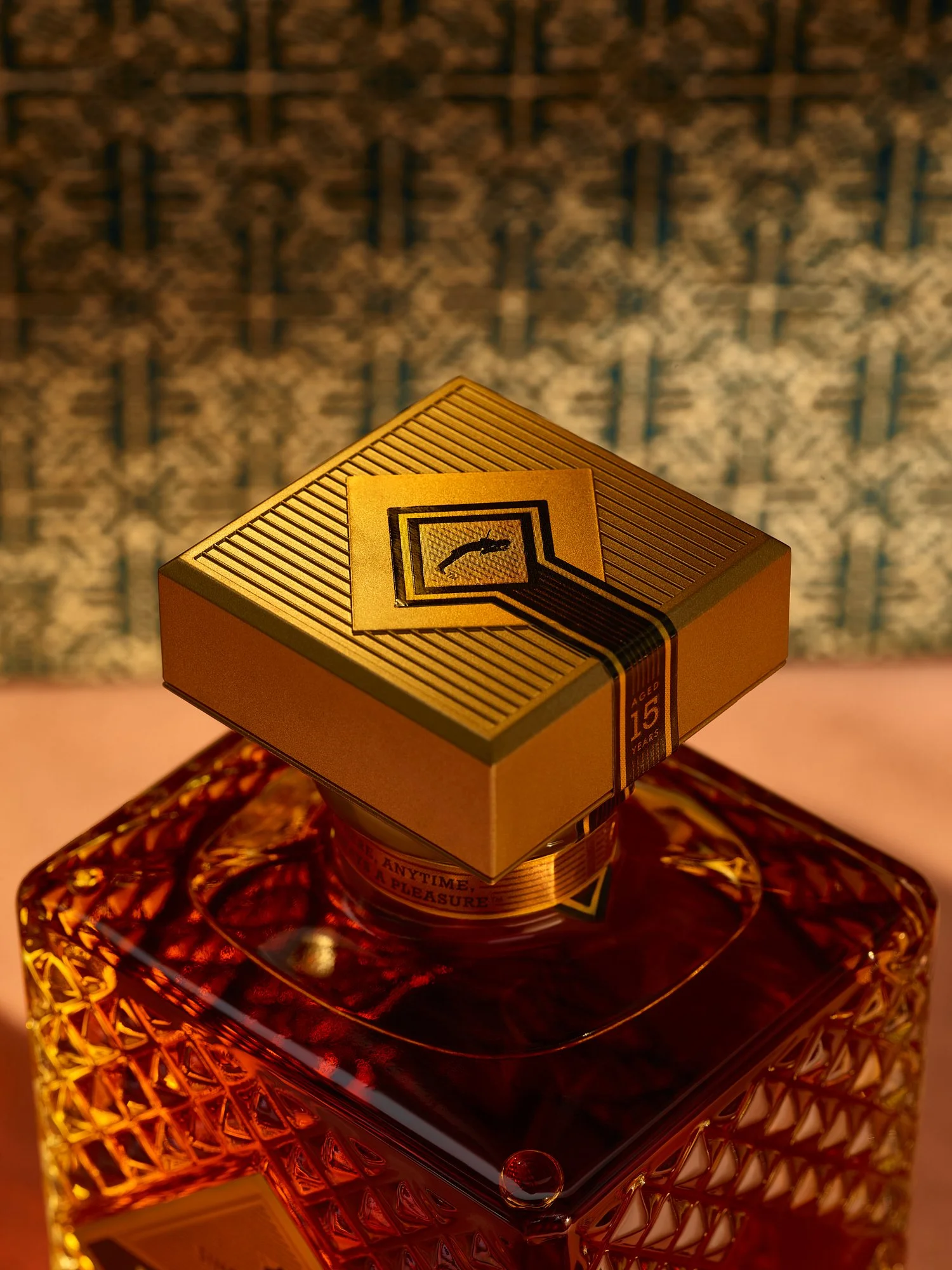
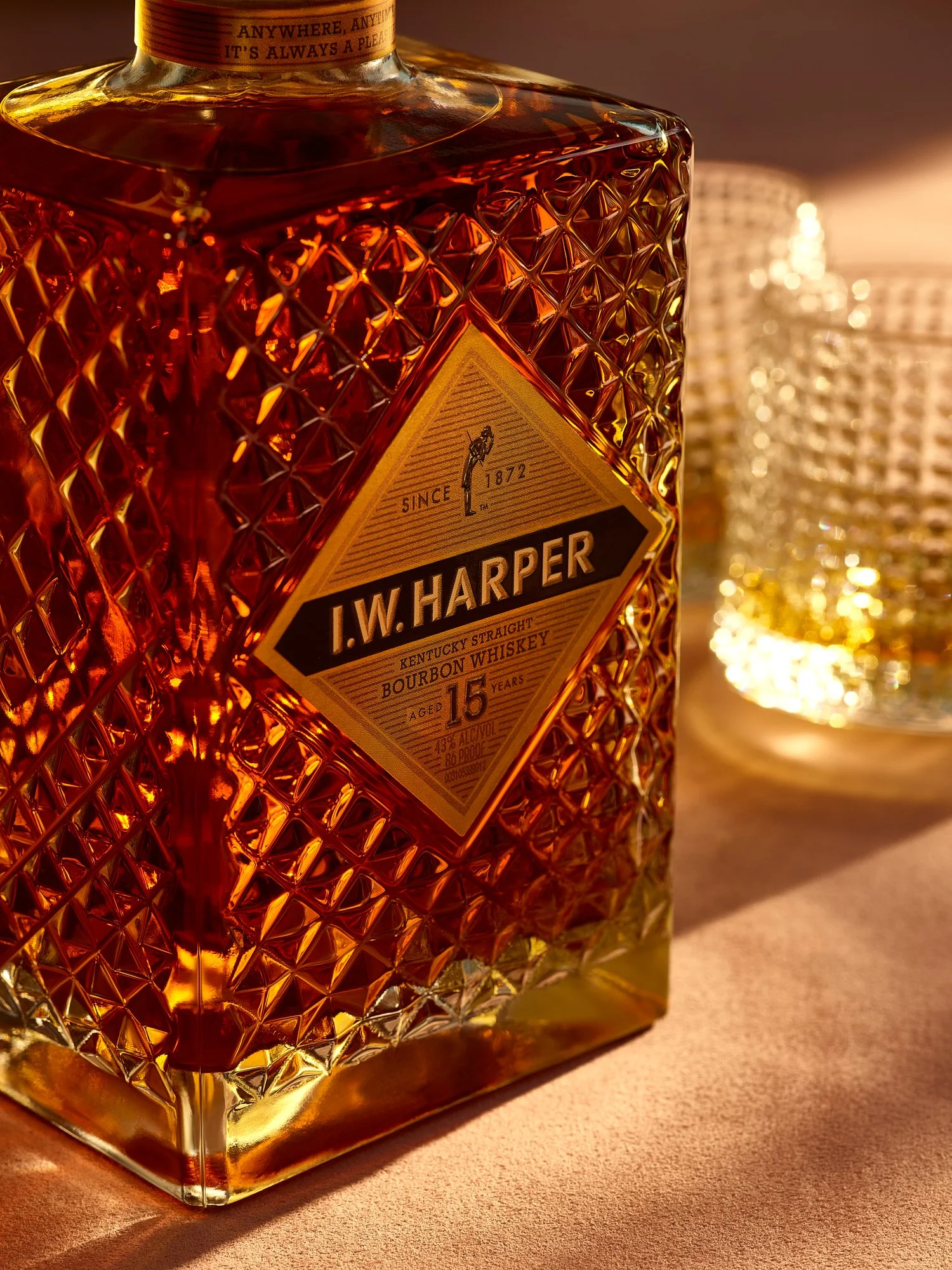
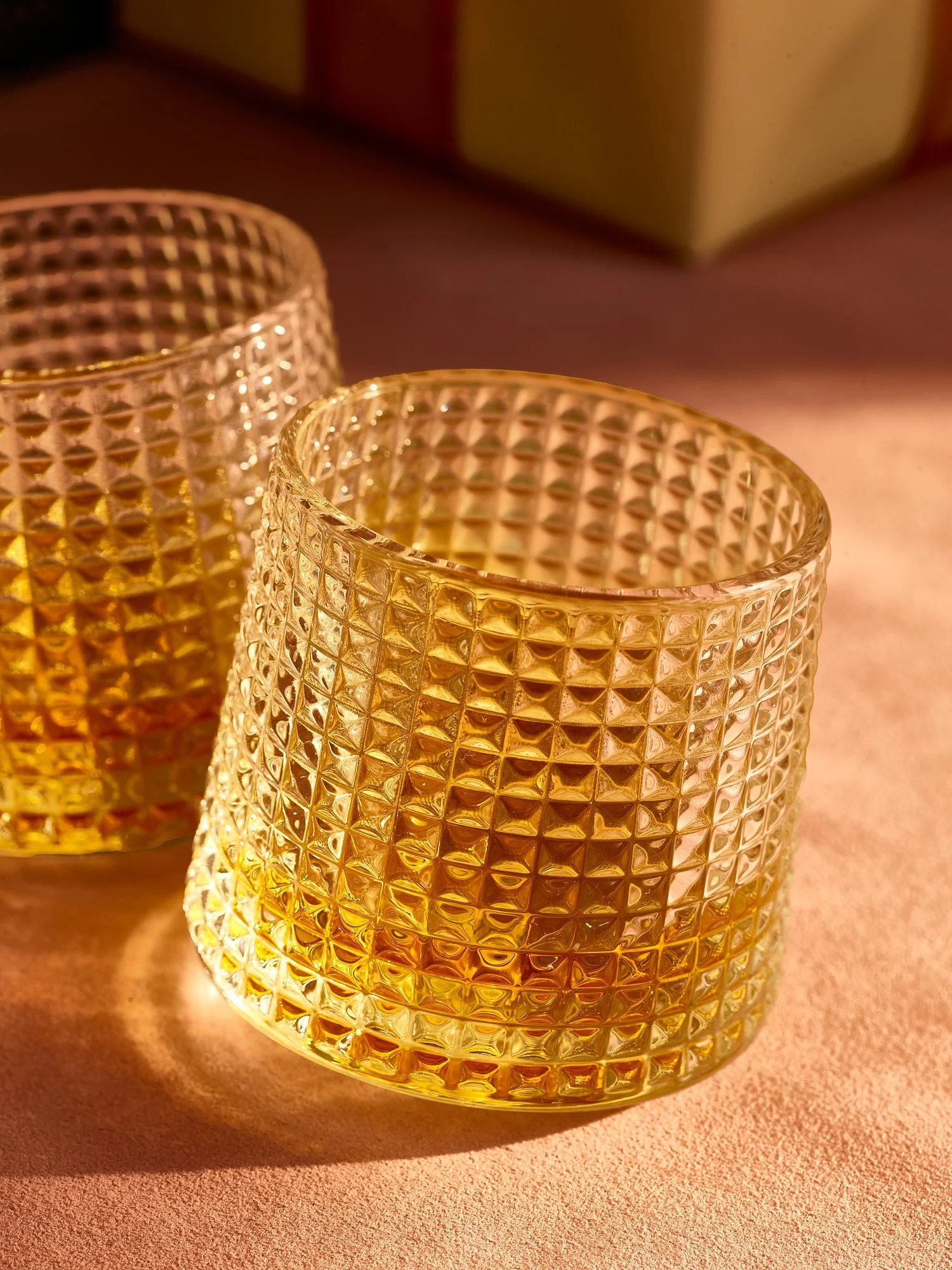
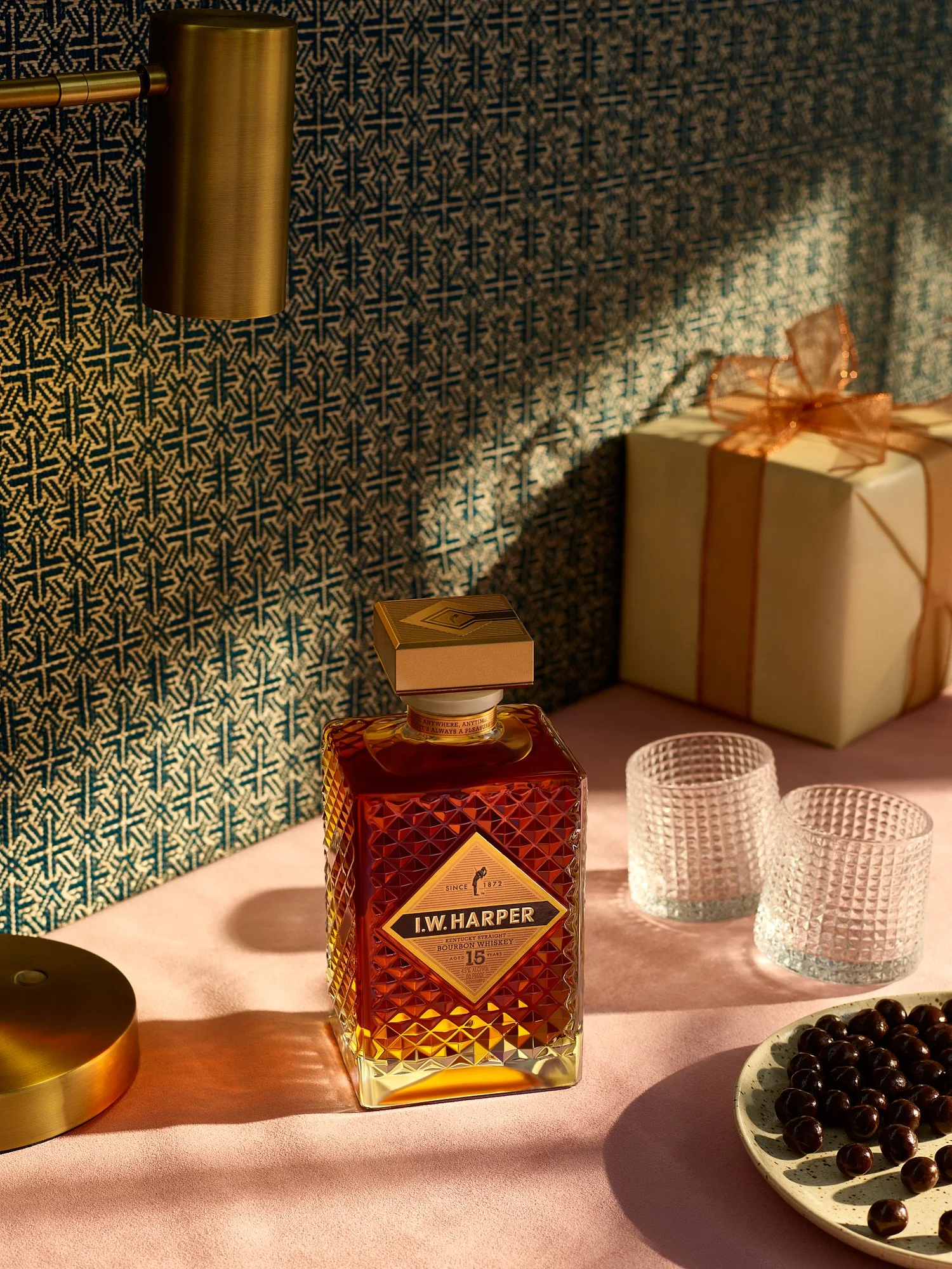
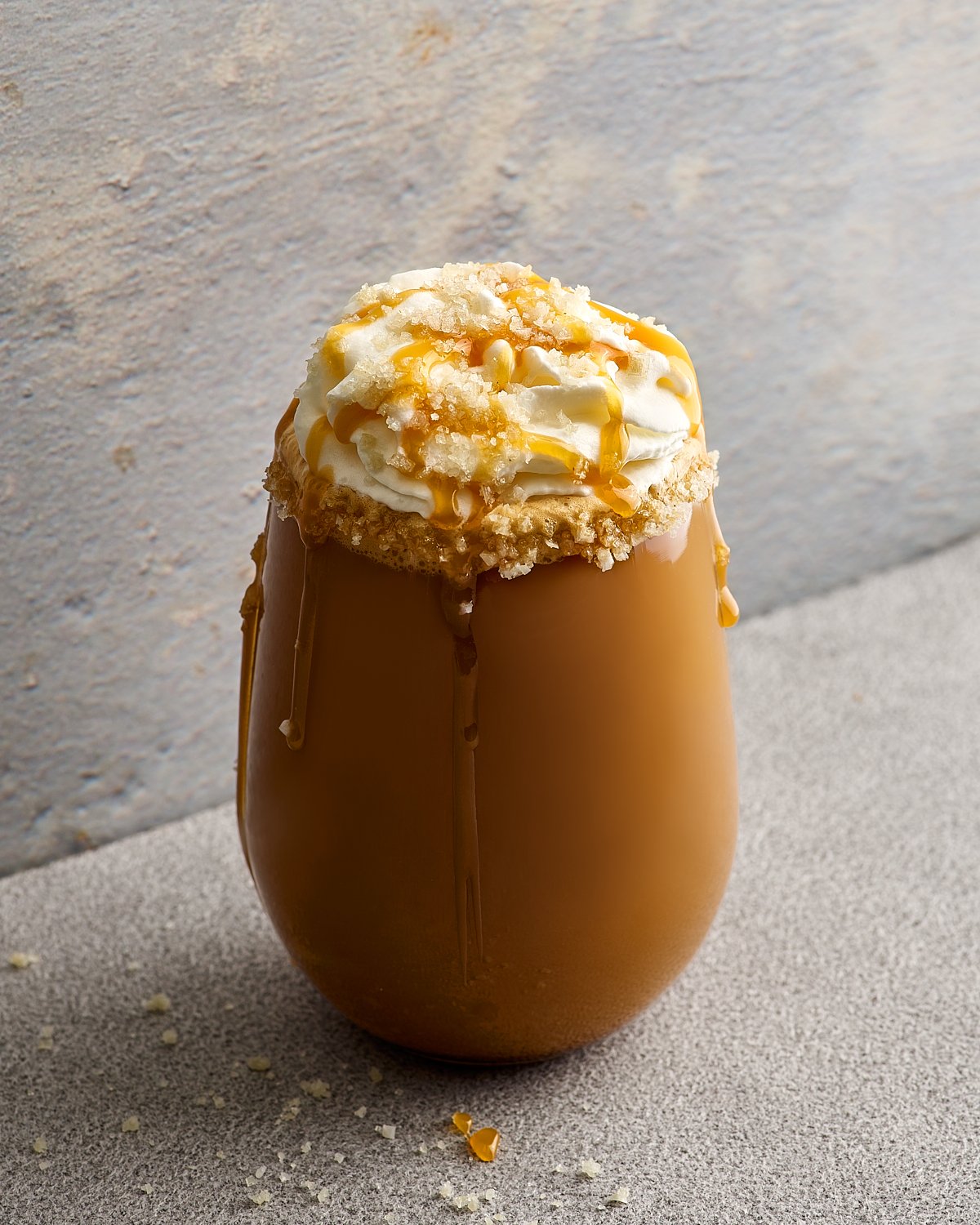
The Anti-Cliché: Rethinking Valentine’s
Seasonal campaigns don't have to look predictable. A Valentine's series built around restraint, texture, and storytelling by Dhanraj Emanuel.
Every February, everything turns red.
Not just red. Loud red. Glossy pink. Hearts, roses, soft-focus glow. Or the other extreme, delicate pastels and dreamy haze. The visual landscape becomes a monoculture of crimson and pink. Decorative. Predictable. Safe.
I’ve always felt that a celebration as universal as Valentine’s Day deserves something more nuanced. Quieter. More grounded. More adult. The goal was simple: create a Valentine’s series without borrowing its aesthetic from the greeting card aisle.
I wasn’t interested in copying the symbols. I wanted to distill the feeling.
To me, Valentine’s Day is about anticipation. Intimacy. An evening that feels intentional.
The Parameters
I built the series around a few deliberate constraints.
The light had to feel like a specific time of day. Directional. Intentional. Something closer to evening than holiday cheer. That shift alone changes the emotional tone from decorative to intimate.
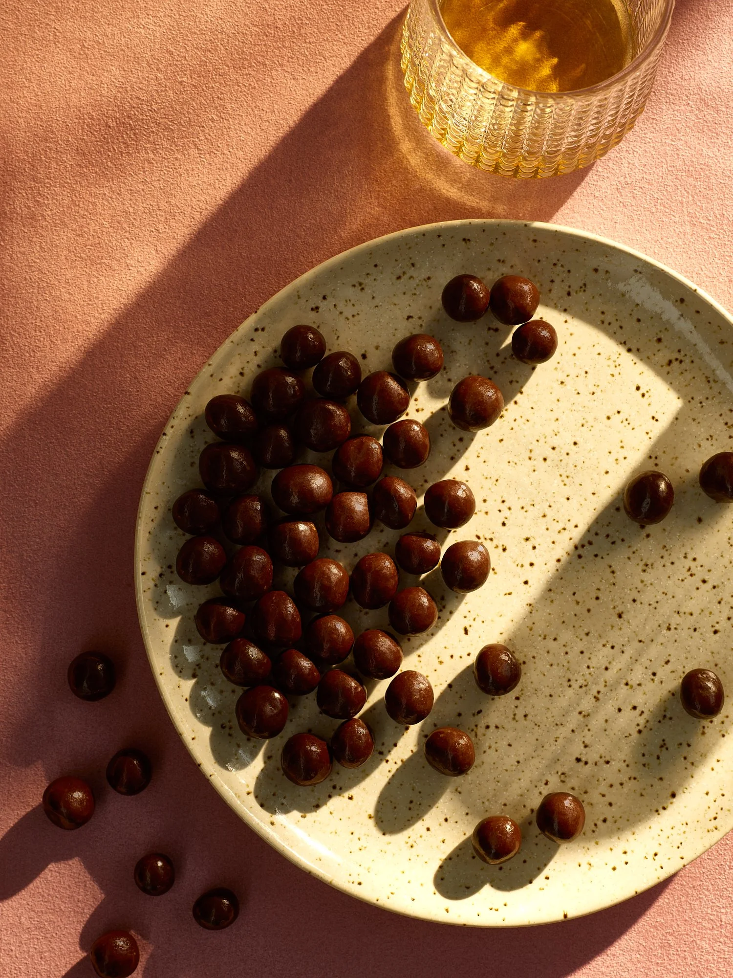
The palette needed to nod to Valentine’s without surrendering to it. Dusty rose, brass, gold, and a restrained blue for depth. Pink remained, but it was restrained and deliberate.
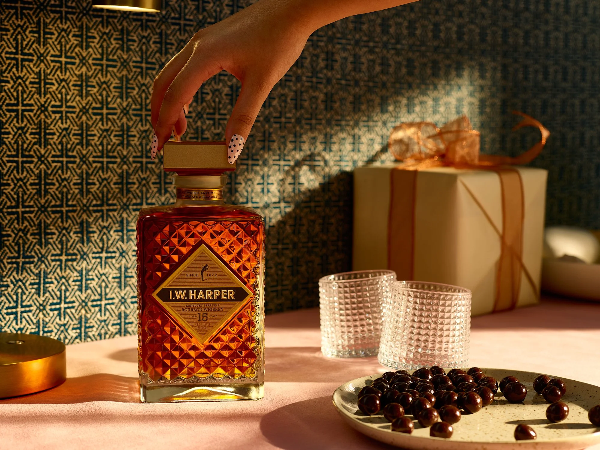
The subject was bourbon. Rare in the Valentine’s space, yet perfectly suited to it. Warm, ritualistic, and grounded. It reframes romance away from confection and toward experience.
And the texture mattered. No soft haze. I leaned into weight and material. Cut glass. Polished brass. Architectural shadow. I wanted the viewer to feel the room.

Overall, I wanted to move past the superficial and create something intimate. Strip away the cliché. Keep the emotional truth. Build from there.
When the focus shifts from symbols to story, the work outlasts the season. Seasonal food and beverage advertising photography by Dhanraj Emanuel, available nationwide for CPG brands, spirits companies, and advertising agencies seeking campaign imagery that breaks from category conventions.

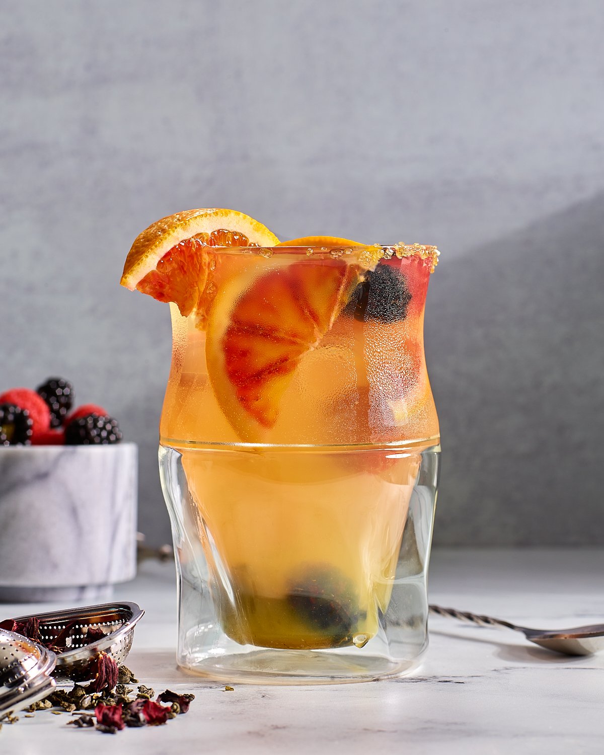
Let’s Call It Summer Already
A summer food series — abundant, sun-drenched, unhurried. Commercial food photography by Dhanraj Emanuel.
We're nearly there. It's been a long winter and a lingering spring. The light lasts a little longer each night, the produce is getting brighter, and the air is starting to hum with that unmistakable summer energy.
This series captures the essence of a summer afternoon, unhurried, sun-drenched, and filled with moments of abundance. A table set with early summer's best: grilled eggplant, green tomato stacks, blackberries, figs, hummus, and ribbons of squash. All bathed in summer's light and styled with an ease that feels instinctive.
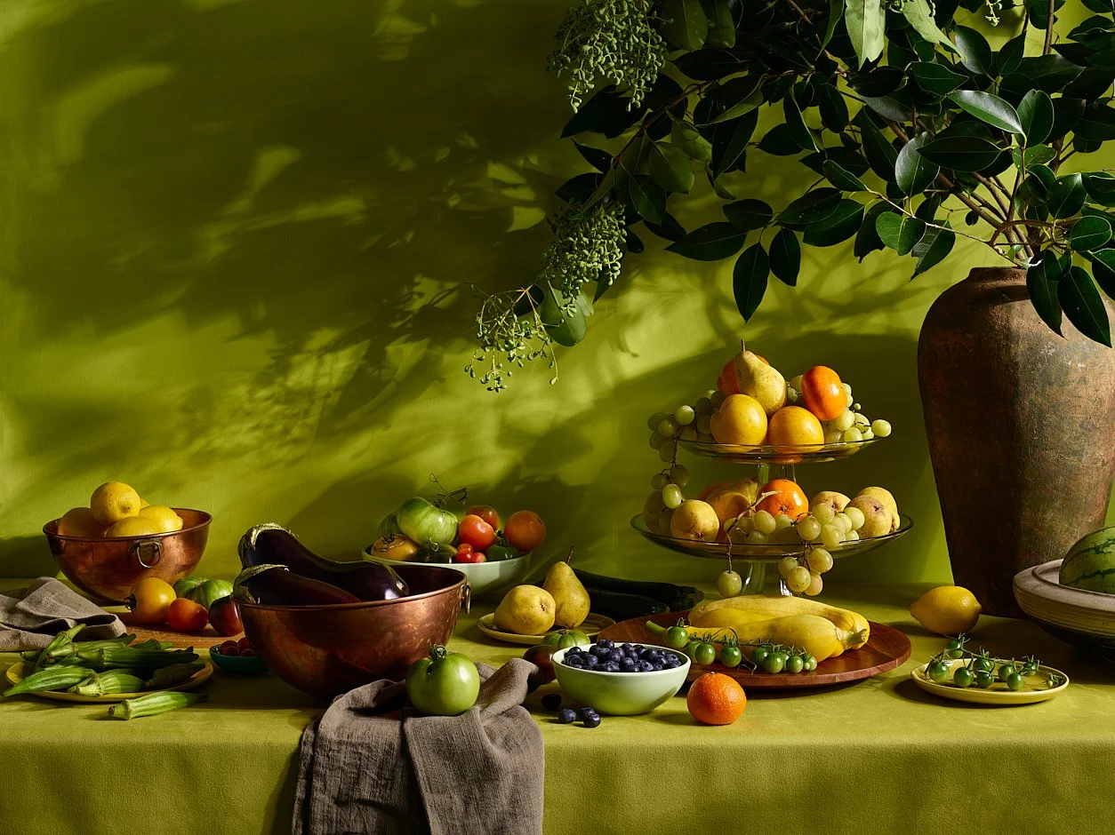
The table invites you to stay. The light lingers. And the rhythm of the day slows. This is a season that asks us to pause and savor. This kind of imagery doesn't just showcase food; it creates a sense of place. It stirs memory, sets a tone, and fosters connection. For cookbooks and food & beverage brands looking to create content that stands out and resonates, this is the kind of visual storytelling that delivers.


Whether you're planning a campaign, launching a product, or creating content for editorial, packaging, or digital platforms, this is the season to lean into richness. More texture, more mood, more of what makes your audience stop and feel.


Summer seasonal food photography by Dhanraj Emanuel, studio-based in Greensboro, NC, available nationwide for food and beverage brands, grocery retailers, cookbook publishers, and editorial clients seeking campaign imagery that captures the mood of the season.
Styling: Christy Day

When Craft Meets Craft
Photographing Indri Single Malt Indian Whisky — where the precision of distilling meets the craft of commercial beverage photography.
Some photo shoots are about moments. Others are about brands. But then there are those rare ones that feel like rituals—where the photographer's inherent aesthetic sensibility aligns seamlessly with the craftsmanship of the product, creating a quiet collaboration between distiller and image-maker.

That was the experience of photographing Indri Single Malt Indian Whisky—a project that exemplifies what exceptional alcohol photography can be. This wasn't just about capturing a bottle of whisky. It was about honoring a premium spirit with roots in Indian tradition and a modern, global presence. That duality shaped every decision, from the warm, burnished lighting to the dramatic shadows and refined compositions that speak directly to the essence of the brand.


Light is everything in whisky photography. The amber tones of a single malt must glow—never flatten or blow out. I leaned into a rich, low-key palette that played with contrast and depth, allowing the golden amber hue of the whisky to shine while complementing the deep earth tones of the packaging. This kind of nuanced lighting and detail-driven setup defines compelling product photography for liquor brands.


Every element mattered—from the embossed cap to the Devanagari script on the label. The styling was clean but evocative, reflecting the whisky's blend of heritage and sophistication.


There is a connection between the precision of distilling and the art of commercial beverage photography. Both require patience, control, and a commitment to storytelling. This shoot was a meeting of two crafts, aligned in purpose and spirit (pun fully intended). Premium spirits and whisky photography by Dhanraj Emanuel, studio-based in Greensboro, NC, available nationwide for single malt whisky brands, premium spirits companies, and beverage advertising agencies.

Past Perfect
Spring brunch food photography series inspired by repurposing and seasonal renewal — soft light, layered tableware, and gathered botanicals by commercial food photographer Dhanraj Emanuel. Available nationwide for food brands, editorial clients, and seasonal campaigns.
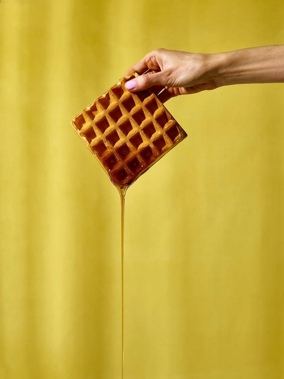
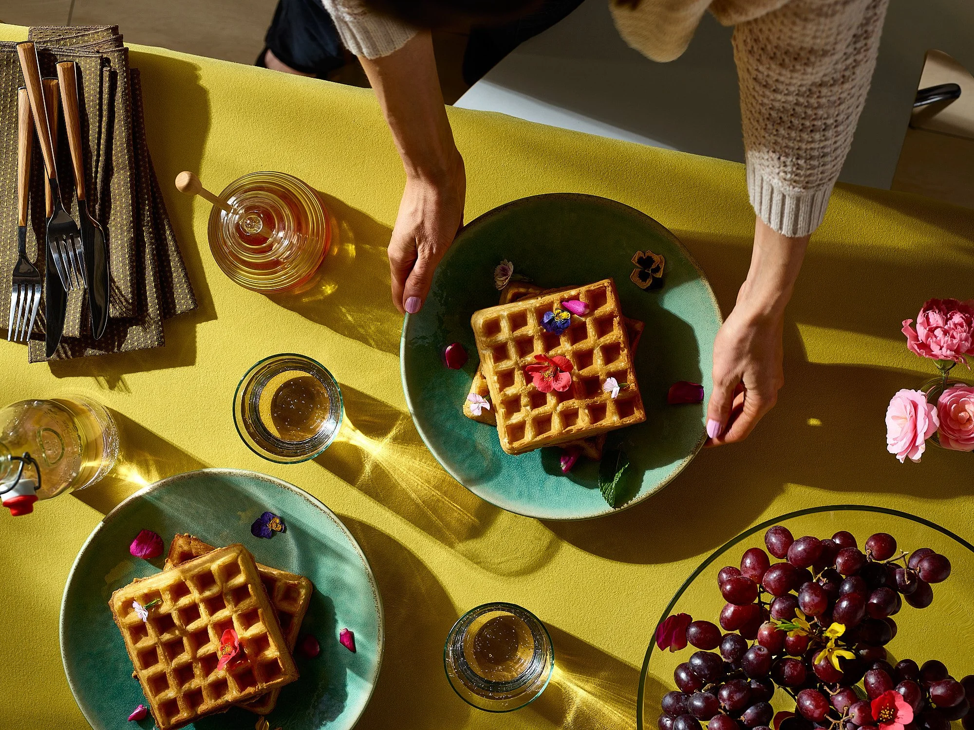
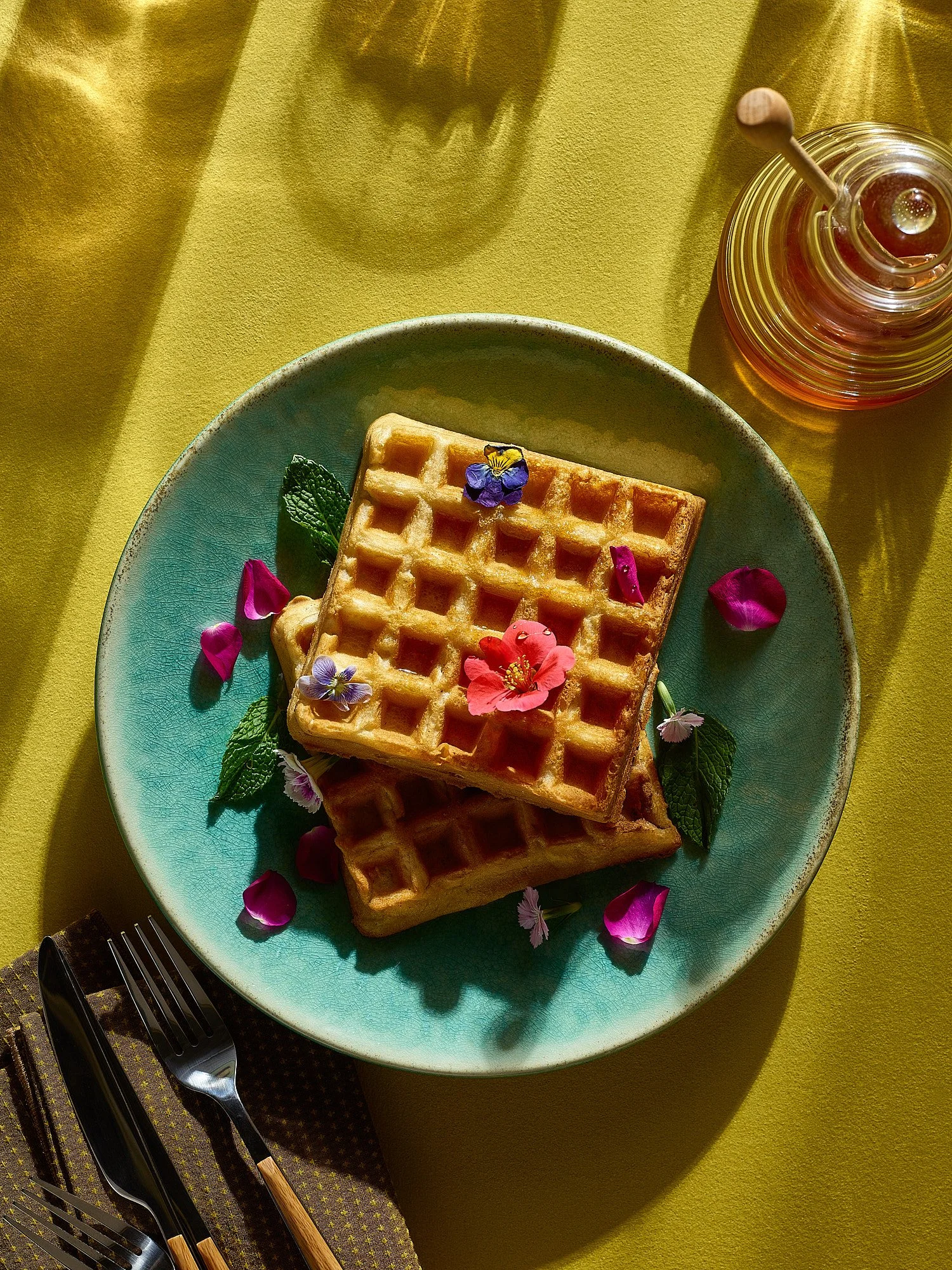
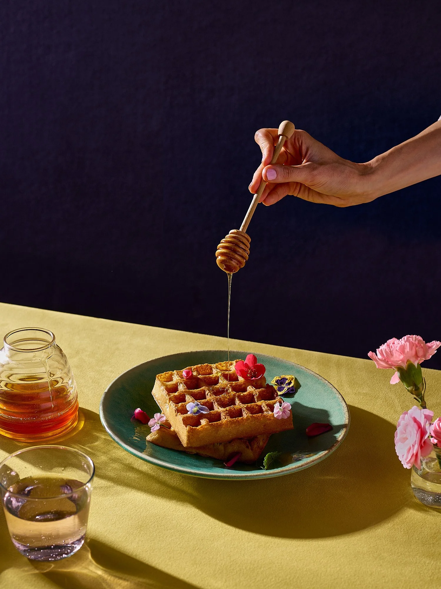
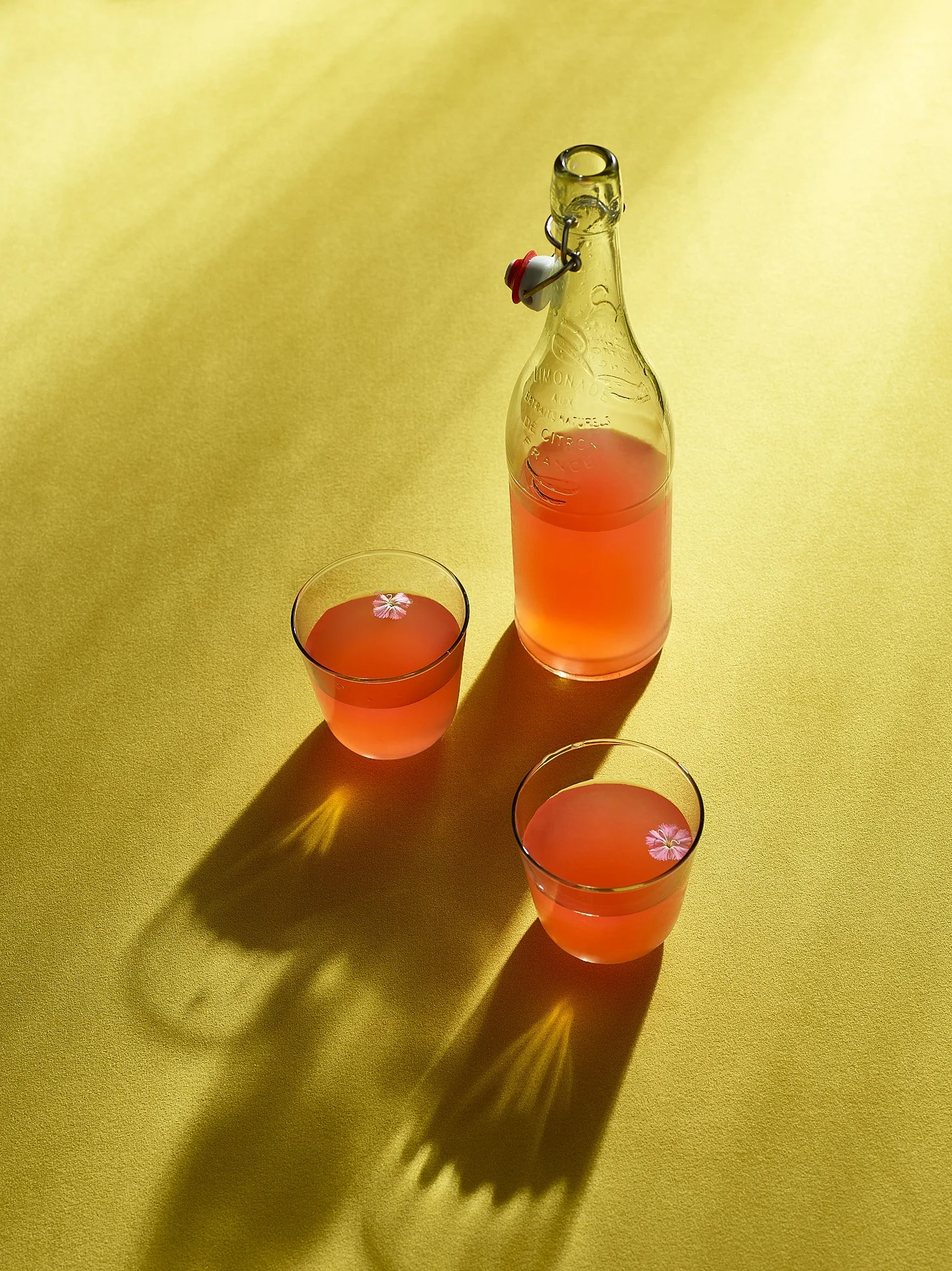
Spring always arrives with a soft insistence—a breeze through the window, a shaft of light stretching just a little longer each day, a craving for citrus and open space. And with it comes that familiar urge: spring cleaning. But perhaps this year isn't about discarding but discovery...
Somewhere between a forgotten box of dishes and a hand-stitched quilt tucked beneath old photo albums lies something rich with history and memory—quietly waiting to find its way back into the everyday.

For this series, we drew inspiration from the growing love of repurposing—mirroring the spirit of spring and new beginnings. The attic, the linen closet, the barely-hinged hope chest—those quiet spaces held stories.


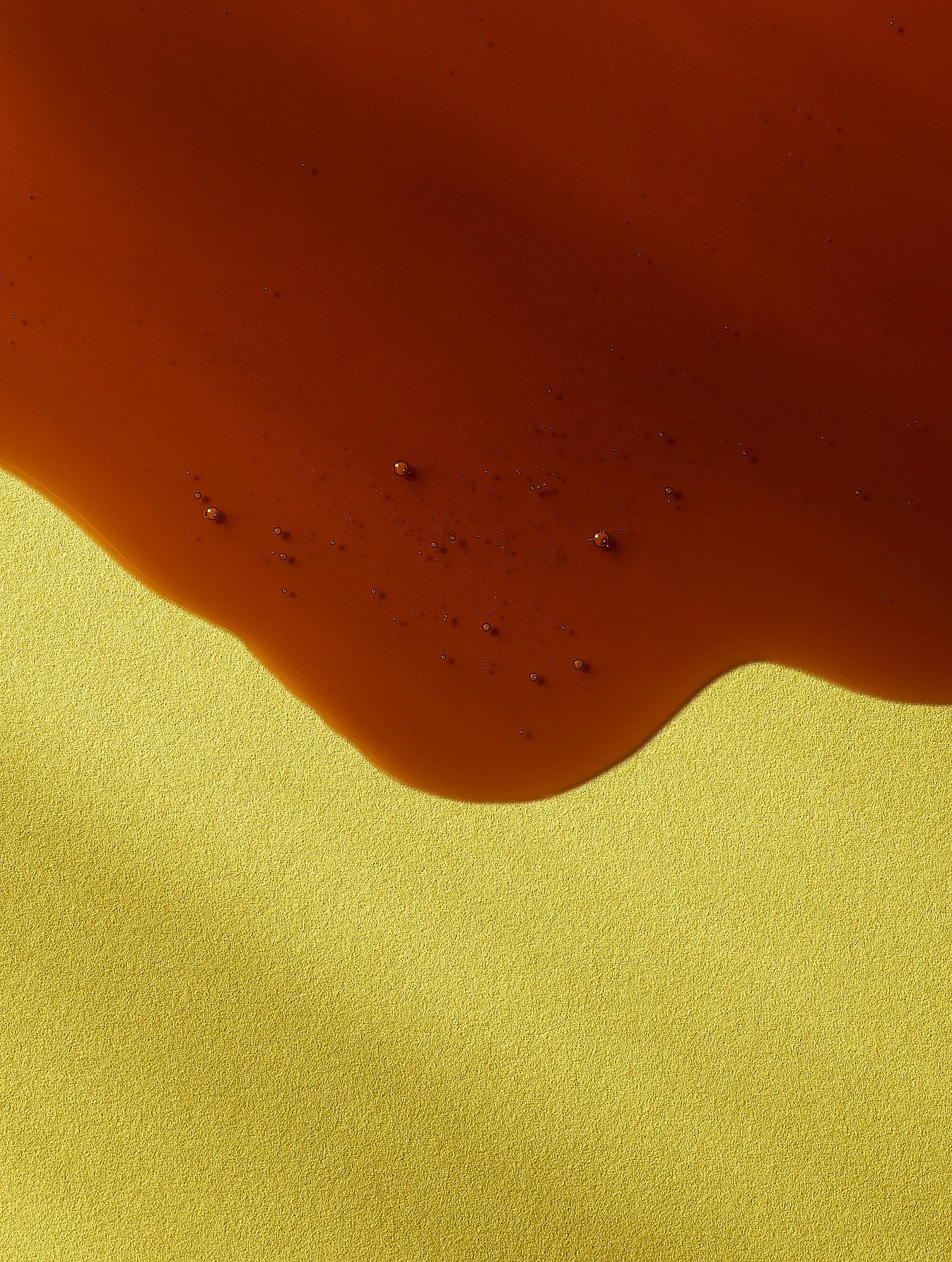
These domestic treasures became the visual language for the collection—bright, warm, and quietly sentimental. Soft yellow backdrops, layered tableware, and gathered botanicals were intentionally styled to feel like the start of something good: a breakfast moment, a casual brunch, a memory that hasn't happened yet but already feels familiar.
And just like that, spring wasn't just a season. It became a moment where past and present sit together at the same table.


Spring seasonal food and brunch photography by Dhanraj Emanuel, studio-based in Greensboro, NC, available nationwide for food and beverage brands, grocery retailers, cookbook publishers, and advertising agencies seeking warm, nostalgic seasonal campaign imagery.

An Act of Love: Scene 1-3
Valentine's Day food and lifestyle photography series exploring romance through gesture, light, and setting — by commercial food photographer Dhanraj Emanuel. Available nationwide for seasonal campaigns, food and beverage brands, and advertising agencies.
Valentine's Day often feels like a well-rehearsed play, where every detail—from the outfit to the dinner reservation—is part of an intricate script. In this series, we step into that narrative, exploring the idea that love itself is a play. Each image becomes a scene, rich with gestures, glances, and settings that echo the emotions played out on the grandest stage of all—the heart.


Through this series, we wanted to capture the aesthetic of romance and its performance—the way love invites us to step into familiar and new roles, rehearse and improvise, and be both audience and actor in our dramas.


This Valentine's Day, lean into the theater of love. Dress for the part, savor each scene, and remember that the most beautiful stories are the ones we live with, not just the ones we tell.


Valentine's Day seasonal food and lifestyle photography by Dhanraj Emanuel, available nationwide for food and beverage brands, CPG clients, and advertising agencies seeking campaign imagery that captures romance with restraint and visual sophistication.

In Winter’s Light
Winter food photography series built around butternut squash — directional light, warm palette, and intentional shadows by commercial food photographer Dhanraj Emanuel with stylist Christy Day. Available nationwide for editorial, branding, and packaging clients.
There’s something unmistakable about winter’s light. Defined by the cold air, it is distinct—soft yet directional, revealing textures and deepening shadows. This series explores its quiet warmth and the emotions its stillness evokes.

Built around a single ingredient—butternut squash—this culinary narrative celebrates winter's cozy rituals. The goal wasn't just to capture food but to create a world where color, texture, and light interact to shape an atmosphere and create an emotional connection.


Directional yet gentle lighting lends depth without losing warmth. Meticulous styling, a precise and disciplined color palette, and intentional shadows work together to create a cohesive visual language.

For editorial, branding, or packaging, photography is more than making food look appetizing—it tells a story. By shaping light, curating color, and embracing texture, a single ingredient becomes a world—one the viewer is invited to step into.
Winter seasonal food photography by Dhanraj Emanuel, studio-based in Greensboro, NC, available nationwide for food and beverage brands, grocery retailers, cookbook publishers, and advertising agencies seeking campaign imagery with mood, texture, and visual sophistication.
Stylist: Christy Day

A Tasteful Year: The Photos That Didn't Go Live
A year-end look at food and beverage images that stayed off the grid — scotch, sardines, yogurt, spices, and more. Commercial food and beverage photographer Dhanraj Emanuel, available nationwide for brands and art directors ready to make bold visual statements.
As the year draws to a close, it's hard not to reflect on the ideas that have fueled my work in the food and beverage space. This year, I took on several different shoots, each offering its own challenges and triumphs. Yet, some of my favorite moments stayed quietly tucked away—until now.


From the intricate textures of almonds to the warm hues of scotch, the raw simplicity of sardines, and the vibrant yogurt bowl, this year's images that didn't go live highlight my ability to capture diverse moods and styles, showcasing the depth and artistry in every shot.


These images are more than just still life; they reflect my approach to capturing mood, color, and story with intention—designed to elevate brands and evoke emotion. My ability to connect a product to its audience through authenticity and aspiration sets these images apart. Whether it's the elegance of minimalist design or the warmth of natural textures, I carefully craft each shot to capture an image and tell a compelling story.


As we move into the new year, I look forward to collaborating with brands, art directors, and creatives who want to make bold statements in the food and beverage world. Let's create visuals that don't just cut through the noise but leave a lasting impression.
Cheers to another year of bringing your stories to life!

A Thankful Table
Thanksgiving food photography celebrating imperfection, warmth, and the beauty of a table set with intention. Commercial food photographer Dhanraj Emanuel, available nationwide for holiday campaigns, grocery brands, and editorial clients.
From the slightly wrinkled linen tablecloth that drapes effortlessly over the table to the rustic charm of dishes arranged with care, this series of images isn't about showcasing perfection—it's about celebrating what brings us back to the table year after year.
The dishes tell their story: the charred edges of grilled vegetables, the uneven dollop of mashed potatoes, and the unmistakable warmth of food prepared with love remind us that the beauty of Thanksgiving lies in its imperfections.
Each element contributes to the table's character, reminding us that Thanksgiving isn't about impressing but connecting.


Holiday and Thanksgiving food photography by Dhanraj Emanuel, studio-based in Greensboro, NC, available nationwide for grocery retailers, food and beverage brands, and advertising agencies seeking seasonal campaign imagery that feels warm and authentic rather than staged.

Celebrating Light
Diwali food photography series celebrating Indian sweets, textiles, and festive light — by commercial food photographer Dhanraj Emanuel with stylist Christy Day. Available nationwide for multicultural food campaigns, CPG brands, and editorial clients.
As someone who uses light to tell visual stories, Diwali—known as the festival of light—presents a unique opportunity to work with warm, sparkling light and deep, expressive shadows. This interplay of light and shadow mirrors the cultural significance of light overcoming darkness. For this series, I aimed to capture the essence of 'celebrating light' by using it expressively to highlight the opulence of vibrant colors, intricate textures, and the rich cultural symbolism of Diwali.

The scene is set in unapologetically Indian colors and textiles—bold saffrons, rich reds, and vibrant yellows that speak to the cultural vibrancy of Diwali. These colors aren't just decorative; they are steeped in tradition, each shade and texture carefully selected to evoke warmth, abundance, and festivity.

By layering traditional Indian elements—textured fabrics, decorative diyas, and opulent serving trays—Stylist Christy Day and I set out to create images that felt both intimate and grand, honoring Diwali's spirit of celebration.


Diwali and Indian cultural food photography by Dhanraj Emanuel, studio-based in Greensboro, NC, available nationwide for food and beverage brands, CPG clients, and advertising agencies seeking culturally specific seasonal campaign imagery.

When Seasons Meet
A summer-to-fall food and styling series savoring the in-between — warm palettes, transitional light, and a unified vision across food, flowers, and fabric. Commercial food photography by Dhanraj Emanuel with stylist Christy Day, available nationwide.
"When Seasons Meet" savors the last traces of summer and anticipates the warmth and depth that autumn brings. It celebrates the present with a nod to the past and the anticipation of the future.

Our intent:
With this collaborative series, Stylist Christy Day and I set out to create a visual representation of the transitionary time when the heat of summer has passed, but the cozy sweater weather of fall has not yet arrived.

Our Approach:
We chose to display the contrast of the soft pastels of summer, intermingled with the rich, earthy tones of fall. Vibrant yellows and greens give way to the deeper, muted hues of autumn, where the last rays of summer linger before transitioning to the golden light of fall. The color palette story was an opportunity to introduce an additional cohesive element to the project. A rustic autumn-like background creates a tonal setting that makes the pastels of summer pop. The light in this series plays a key role—neither bright and harsh nor soft and gentle—expressing the subtle shift between the seasons.
This shoot was an exercise in maintaining a consistent aesthetic across different subjects. By carefully using light, color, and texture, we showcased food, flowers, and fabrics in a way that ties everything together for a seamless, unified vision.


Seasonal food and lifestyle photography by Dhanraj Emanuel, studio-based in Greensboro, NC, available nationwide for food and beverage brands, grocery retailers, and advertising agencies seeking campaign imagery that captures seasonal transition with visual sophistication.

Packaging Blue Zones' Philosophy
Packaging photography for Blue Zones Kitchen's Whole Foods launch — by Dhanraj Emanuel for Buttermilk Creative.
I recently completed a packaging photoshoot for Blue Zones Kitchen, a unique brand co-founded by Dan Buettner that promotes longevity through plant-based, nutrient-dense frozen meals inspired by the diets of the world's Blue Zones—regions like Okinawa, Japan, and Sardinia, Italy, where people live significantly longer lives. Here's a look at our process…
The Challenge:
To create packaging that not only appealed to health-conscious customers but also authentically reflected the Blue Zones Kitchen philosophy. The packaging needed to seamlessly communicate the health benefits of the frozen meals while capturing the depth and richness of the brand's ethos. In the highly competitive CPG market, brands must quickly convey their unique selling point.

Our Solution:
For this project, packaging design expert Andy Kurtts of Buttermilk Creative collaborated with design studio GROUP CHAT to develop the initial design concept. The approach for Blue Zones Kitchen focused on creating a visually compelling narrative that resonates with consumers' growing demand for healthy, convenient, and plant-based options. We prioritized the brand's authenticity, integrating it throughout the process. Clean, vibrant visuals showcased the natural ingredients and global inspiration behind each meal.

The front of the packaging prominently features the product name and a vibrant, appetizing photo of the meal, set against a backdrop that hints at the exotic and nourishing nature of Blue Zones diets. This ensures that even a quick glance at the packaging conveys a sense of health, authenticity, and quality.

Our Process:
In keeping with Blue Zones Kitchen's philosophy of handmade, earth-based, and thoughtfully crafted meals, we collaborated with renowned ceramic artist Ibrahim Said to create a custom blue plate. This plate was designed to echo the calming and nourishing environments of the Blue Zones, enhancing the brand's overall visual narrative. The blue plate not only complemented the brand's aesthetic but also added a layer of authenticity and craftsmanship, further aligning with Blue Zones Kitchen’s core values.
This attention to detail is crucial in the CPG market, where storytelling and visual appeal significantly impact consumer perception and purchasing decisions. The blue plate, now an instant branding element, conveys the brand’s commitment to intentionality and well-being, reinforcing its message of healthy, purposeful living.
Video of ceramic artist Ibrahim Said making the blue plate for Blue Zones Kitchen's frozen food packaging.


Andy Kurtts designed the packaging and art-directed the shoot, ensuring that every element resonated with Blue Zones Kitchen's values of quality, intentionality, and a commitment to promoting longevity through mindful eating. Together, we brought Andy’s vision to life, making it a beautiful reality.

Our Results:
By focusing on authenticity, quality, and visual storytelling, the packaging design for Blue Zones Kitchen effectively communicates its core values, appealing to health-conscious consumers and standing out in the crowded CPG market.
We delivered on time and within budget, helping launch the product nationwide in Whole Foods Markets.

CPG food packaging photography by Dhanraj Emanuel, available nationwide for brands and advertising agencies. Studio-based in Greensboro, NC with full production capabilities for packaging, advertising, and editorial campaigns.
Ceramic Artist: Ibrahim Said
Packaging Design: Andy Kurtts and Group Chat
Food Stylist: Lani Paul
Music: Alejandro Rutty
Video Editor: Amber Hogan
Color Grading: Nahun Lopez
Click here to Connect with me

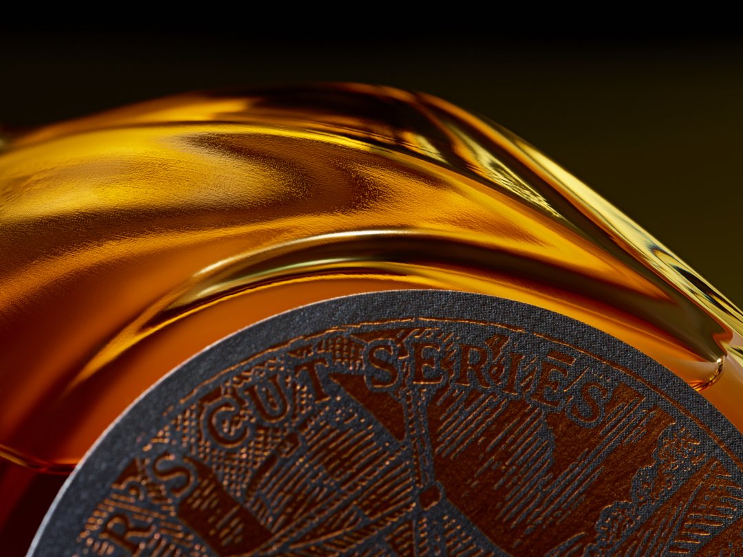
A journey in every glass
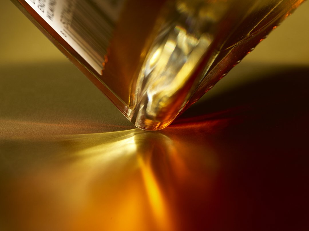
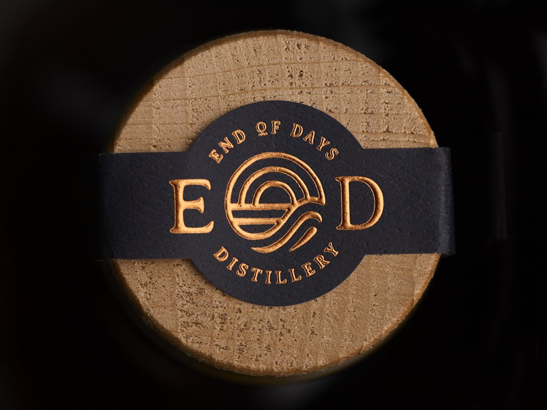
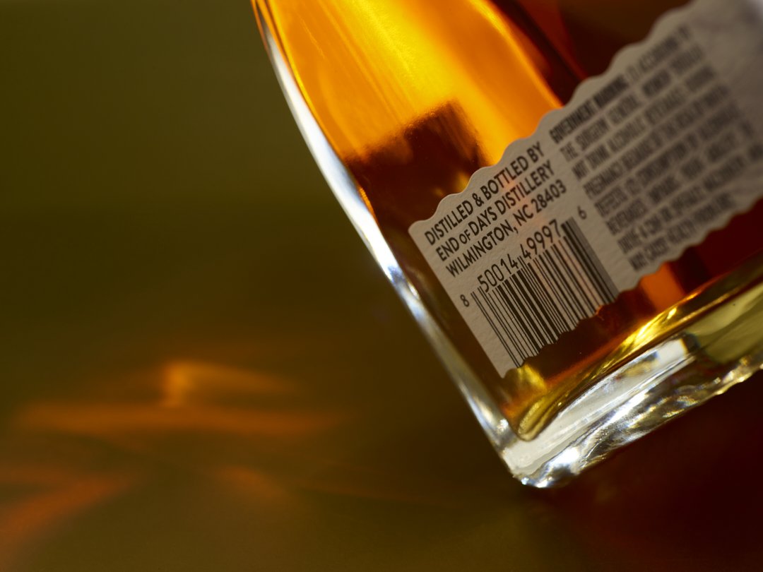
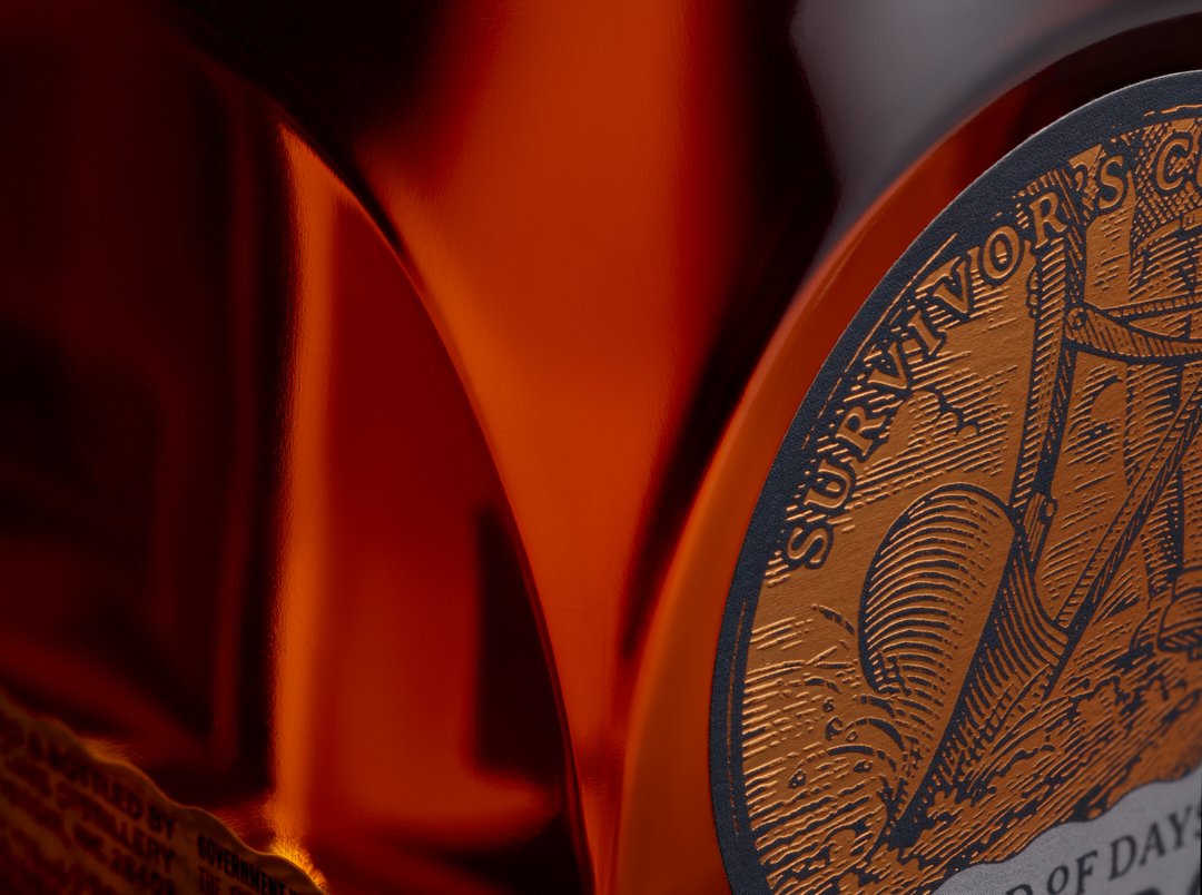
Craft bourbon photography for End of Days Distillery in Wilmington, NC — Survivor's Cut bourbon by commercial spirits photographer Dhanraj Emanuel. Available nationwide for craft distilleries, spirits brands, and beverage advertising agencies.
As the year draws to a close, it is time to take stock—boxes to check, wins, losses, lessons learned, and unresolved events that defy categorization. You could take out a sheet of paper and get to work, or pour a glass of Survivor's Cut bourbon from End of Days Distiillery in Wilmington, NC, and sit in quiet contemplation with that steadfast companion who has been there all year to lift your spirits, celebrate your victories, and soothe the ache of losses.
Distilled from a grain mash of corn, 2-row malted barley, and rye, and quietly aged in a new American Oak cask, Survivor's Cut is more than just a drink; it's a journey in a glass. May this ritual of embracing uncertainty and finding comfort in the unknown encourage clarity, gratitude, and the courage to journey on...
End of Days Distillery is a craft bourbon producer based in Wilmington, North Carolina, and Survivor's Cut is their flagship expression — a corn, malted barley, and rye mash aged in new American Oak. Photographing craft spirits for a brand with this kind of character requires a visual approach that matches the narrative weight of the product. The lighting here was designed to feel like late evening amber, warm and contemplative, referencing both the color of the whiskey and the mood of the brand. Craft distillery photography by Dhanraj Emanuel, studio-based in Greensboro, NC and available nationwide for spirits brands, craft distilleries, and beverage advertising campaigns.


For those in need of professional imagery, consider the expertise of a food and beverage photographer who excels in advertising photography and editorial photography. Their skills in culinary photography and still life photography will beautifully highlight the essence of your brand. Whether for product photography, branding photography, or lifestyle food photography, an established commercial photographer can make your brand unforgettable.

Crafting Innovation: The NoBull Burger Packaging Project
CPG packaging photography for NoBull Burger's national Whole Foods launch, by Dhanraj Emanuel for Buttermilk Creative.
In the grocery world, it's not often that a client takes risk to stand out in the frozen veggie burger category. NoBull’s decision to veer from the conventional path of showing a veggie burger in a bun and instead embrace the unconventional was, in essence, an act of courage. This redesign coincided with a recent launch nationally in Whole Foods Market so there was a significant amount of risk in the unconventional design direction. It was a decision to trust the creative vision and to believe that something different could resonate with consumers and leave a lasting impression.

Inspired by a photograph in my portfolio, the client wanted to showcase their ingredients, reflecting the authenticity and quality of their products. This was an invitation to step away from the conventional norms of packaging photography and embark on a journey that would eventually set their product apart from others on the grocery store shelf.

Andy Kurtts, creative director at Buttermilk Creative, was crucial in this project. As a long-time friend and collaborator, his ability to convey the vision, the essence of the brand, and the potential impact of this approach was pivotal—he bridged the gap between the client's aspirations and creative risk-taking. The trust built over years of partnership laid the foundation for this project.

The opportunity to create work that stands out from the crowd is a privilege. In a world oversaturated with visual stimuli, brands that break free from the norm have the chance to make a lasting impact on consumer perceptions. NoBull (link: https://nobullburger.com/) embraced this chance to elevate its brand and authentically engage its audience.


Packaging photography for CPG brands requires a fundamentally different approach than editorial or advertising work. The image has to perform at shelf scale, competing against dozens of other products in the same freezer case, while also working across digital platforms and marketing materials. Every lighting decision, every compositional choice, every ingredient placement is made with that retail context in mind. The NoBull project, shot in studio in Greensboro, NC with food stylist Lani Paul, was a strong example of what happens when a brand and its creative team trust the photography to do the strategic work.
Client: NoBull Burgers
Agency: Buttermilk Creative
CD: Andy Kurtts
Studio: Dhanraj Emanuel Photography
Food Stylist: Lani Paul

Cheers to Summer with Miller Lite's Beer Cubes!
Behind the lens of Miller Lite's Beer Cubes summer campaign — beverage advertising photography by Dhanraj Emanuel for DDB Chicago.
Working with DDB Chicago's creative team, the brief called for something that had never quite been attempted at this scale: beer served alongside perfectly crafted model ice cubes, photographed to capture both the structural precision of the concept and the refreshing, summery feel of the Miller Lite brand. The tension between those two things, clean geometric form and loose summer energy, was the creative challenge at the center of every lighting and composition decision.
Working with model ice, fabricated props designed to photograph exactly as real ice would without the melting and inconsistency that comes with the real thing, requires its own technical discipline. Surface reflection, the way light passes through the material, and maintaining the illusion of authenticity all have to be managed simultaneously. The crew at Throop Studio in Chicago was exceptional. Without that level of production support, the concept simply doesn't work.
The final images ran as part of Miller Lite's national summer campaign. For commercial food and beverage photographers, this kind of assignment, where the concept is genuinely new and the technical bar is high, is exactly what the work is for.
Commercial beverage photography by Dhanraj Emanuel, available nationwide for advertising, CPG, and brand campaigns.


I am incredibly grateful to have been a part of this campaign and work with such a talented team. It was an opportunity that pushed me to explore new horizons, problem-solve on the go, and ultimately create captivating imagery that brings the spirit of summer and the joy of Miller Lite's Beer Cubes to life.🍻
Client: Miller Lite
Agency : DDB Chicago
Production: Shel Burks
Studio: Throop Studio
Agent: Emissary Artists
ECD: Ben Wolan
ACD: Aaron Willard
CD: Patrick Almaguer
AD: Lane Hedler
Copy: Analisha Santini
Executive Producer: Adine Becker
Prop styling: Lorrie Jamiolkowski
Beverage stylist: Michael Nakumura
Photo assistant: Joe Bankmann
Digital tech: Nate Smith
Retouching: Aaron Willard, and Mickey Chesky
.

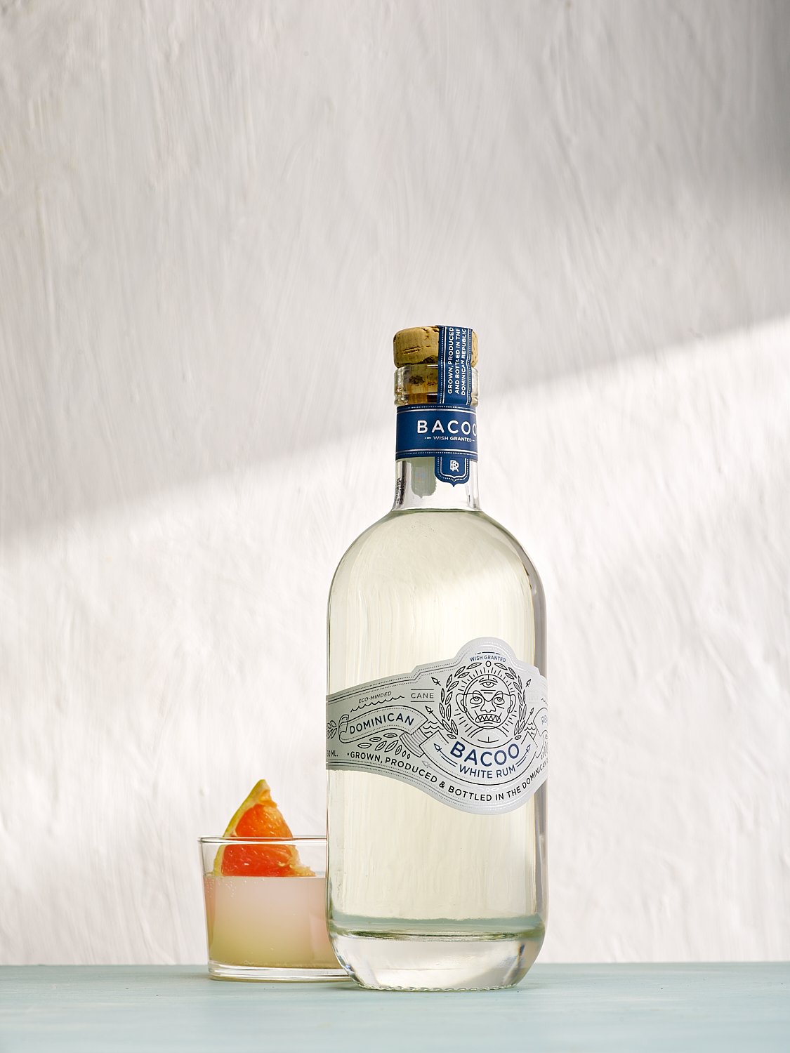
Inspiration is intoxicating.
Bacoo rum spirits photography featuring a preserved moss wall installation and LED continuous lighting, by commercial beverage photographer Dhanraj Emanuel. Available nationwide for spirits brands, beverage advertising, and creative campaigns.
Inspiration is intoxicating. It is the fuel that propels you to think, act and create with intention. I have been considering Mona King's artwork for a while. Still, after contemplating this piece, "Amazon just breathe," for an inordinate amount of time, an idea began to coalesce into a solid vision for what could be. This wall installation, made entirely of preserved natural moss, was the inspiration and the backdrop for a fantasy scene I created to showcase Bacoo, a rum from the Dominican Republic. I love the branding and design of the bottle, and it fit perfectly with the concept.
But what use is an idea without execution? Another thought I have harbored is using an LED light source for still photographs and video. Having transitioned from natural light to strobe, making the switch back to a continuous source was challenging. But tech moves fast, and the new generation of LED lights makes this a viable possibility. To say I could shoot stills and videos using the same light source may seem insignificant, but for someone who spent years fine-tuning the nuance of strobe, this was a big deal.
Many thanks to Mona King for the artwork Amazon, Just Breathe and Alejandro Rutty for the incredible sound track.


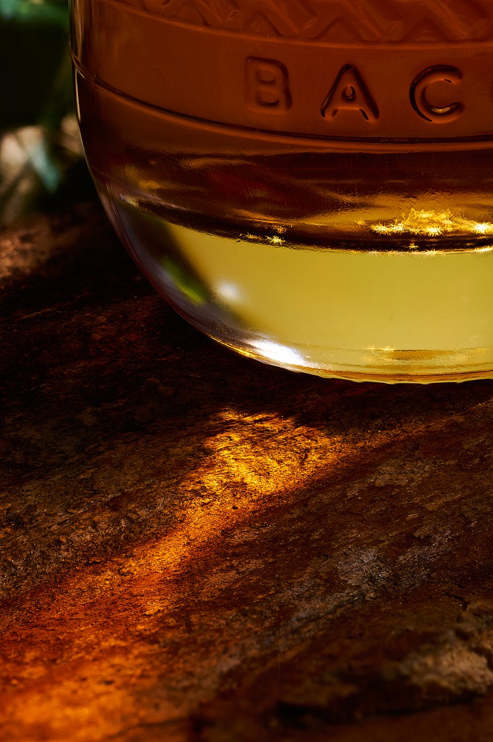


This shoot was spec work exploring the intersection of fine art installation and commercial spirits photography. The preserved moss wall by artist Mona King provided a natural, immersive backdrop that complemented Bacoo rum's organic Caribbean identity. The LED continuous light source used here served double duty for stills and video, a technical approach increasingly relevant for brands that need both formats from a single production. Commercial spirits and beverage photography by Dhanraj Emanuel, studio-based in Greensboro, NC, available nationwide for rum brands, craft spirits, and beverage advertising campaigns.

It's all about candy
Editorial food and bakery photography by Dhanraj Emanuel, based in Greensboro, NC, available nationwide for regional food publications, restaurant groups, independent bakeries, and editorial clients seeking portraits and food photography that tell a complete story.
The focus this month has been on all things sweet. For the February edition of Our State magazine, I had the opportunity to capture a tiny bit of the sweeter side of North Carolina.

Nestled on Main Street in Lexington, NC, The Candy Factory is a journey back in time for someone with a sweet tooth. With wooden barrels and glass jars brimming with candy, chocolate, peppermint, and popcorn, this store takes you nostalgically back to happier memories. I focused on their legendary homemade fudge for the nostalgic character of the sweet treat and the potential for illustrative imagery. All images were made on location, which is a challenge in itself, but one that makes for a fun process. With all the AI imagery floating around, it reminded me that I do this because I love the process.


On-location editorial food photography by Dhanraj Emanuel, based in Greensboro, NC, available nationwide for regional food publications, food and beverage brands, and editorial clients seeking authentic, location-based food storytelling.

Coffee is my cup of Tea
Beverage recipe book photography for BLK&Bold's Recipes for Impact, produced by Canteen for Compass USA. Commercial coffee and beverage photographer Dhanraj Emanuel shot 30 specialty drink recipes in two days. Available nationwide for food service brands, CPG, and publishing clients.
Recipes for Impact is a coffee table book featuring Blk&Bold's barista tried-and-tested recipes. Envisioned and produced by Canteen, a brand of Compass USA. The book features over 30 handcrafted specialty beverage recipes, and caffeinated lovers can rejoice with tea and coffee concoctions that are delicious and community-conscious. 100% of the proceeds go to nonprofit organizations that dedicate their resources to American children in need. The company mantra is "Coffee for you. Impact for our youth."
I love the brand BLK&Bold and its charity efforts in general, but to know that the profits from the sale of this book go to charity made this an extra special project! When Compass USA reached out to see if I’d be interested in shooting the book, I had to keep my excitement in check! From setting up the sets and incorporating the ingredients that infuse to make the drink to perfecting the lighting and adding the chocolate swirl finishing touch, some incredible work goes into crafting the perfect image. Thanks to a brilliant multi-tasking Creative Director/Stylist Mark Kaminski and two stellar assistants, Amber Hogan and Alina Kosmala, we got through 30 shots in two days. Check out our behind-the-scenes videos: I love sharing my creative process...


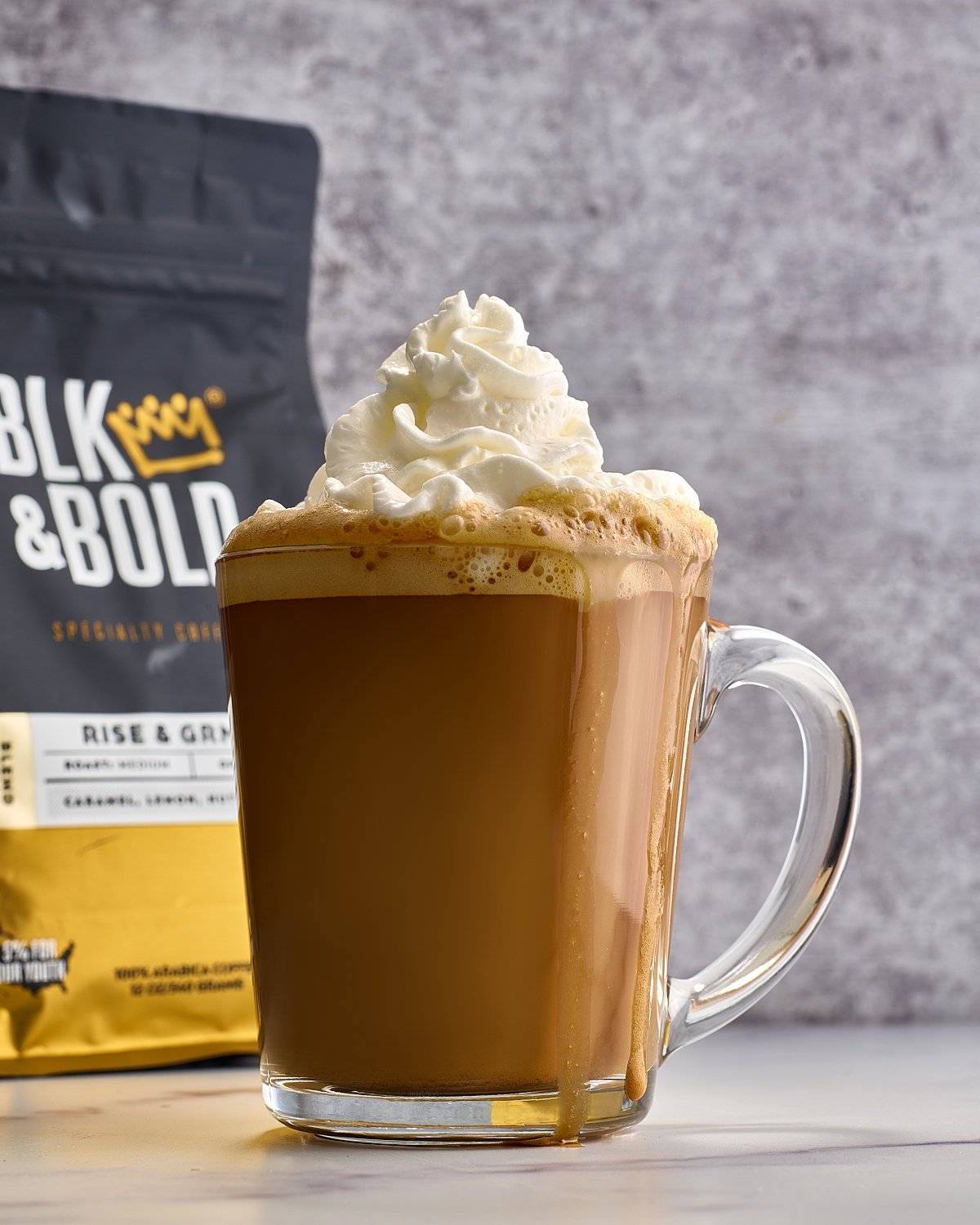
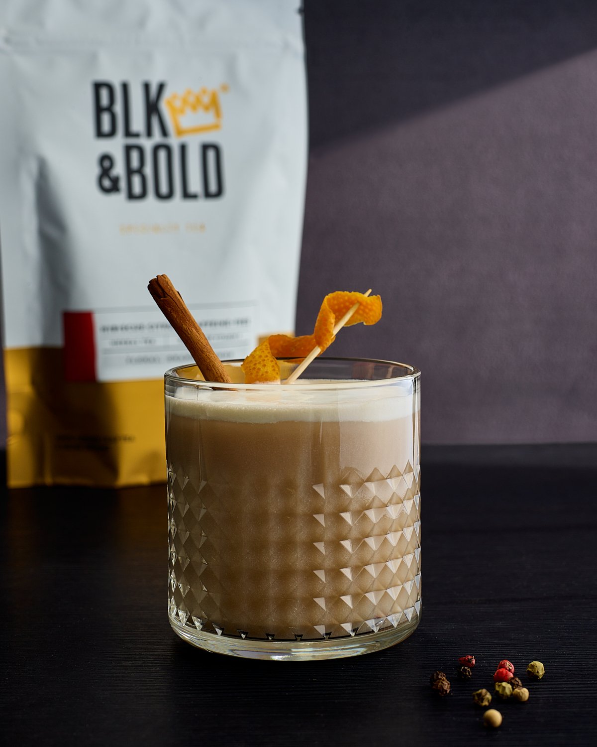


Shooting 30 specialty beverage recipes in two days requires a production approach that is both technically rigorous and creatively flexible. Every drink in the BLK&Bold lineup had a distinct visual identity — different glassware, different ingredients, different finishing touches — and the brief called for images that worked both as stand-alone shots and as a cohesive book. Working with Creative Director and stylist Mark Kaminski of Compass USA, we built a rhythm that kept the shots moving without sacrificing the craftsmanship each image required. Coffee and beverage photography at this pace is only possible when the entire team understands the visual target from the first shot. Commercial beverage and recipe photography by Dhanraj Emanuel, available nationwide for food service brands, CPG clients, and editorial publishing.

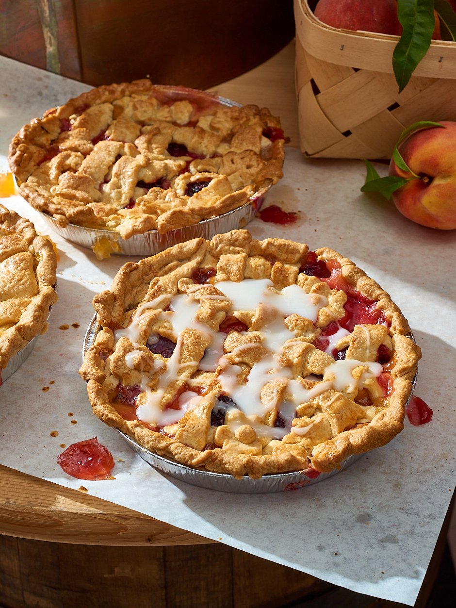
So what's a Sonker, you ask?
Editorial food photography for Our State Magazine — documenting North Carolina's Sonker trail in Mt. Airy, NC. Food photographer Dhanraj Emanuel available for editorial, regional food publications, and restaurant photography nationwide.
The Sonker is a uniquely North Carolinian dessert reminiscent of the traditional Southern cobbler. While food historians debate its origins, the Sonker solidified its fame in Western North Carolina, resulting in an entire trail dedicated to the bakeries and restaurants serving it.
With Our State magazine, I traveled part of the trail to capture these sweet treats and the faces behind them. We made three Mt. Airy pit stops for this photoshoot, first at Anchored Sweet Treats and Eats, then at Miss Angel's Heavenly Pies before finishing the day off at Harvest Grill Shelton Vineyards. From savory to spirit inclusions, each owner puts their spin on the Sonker, making the trail a must-see in NC.

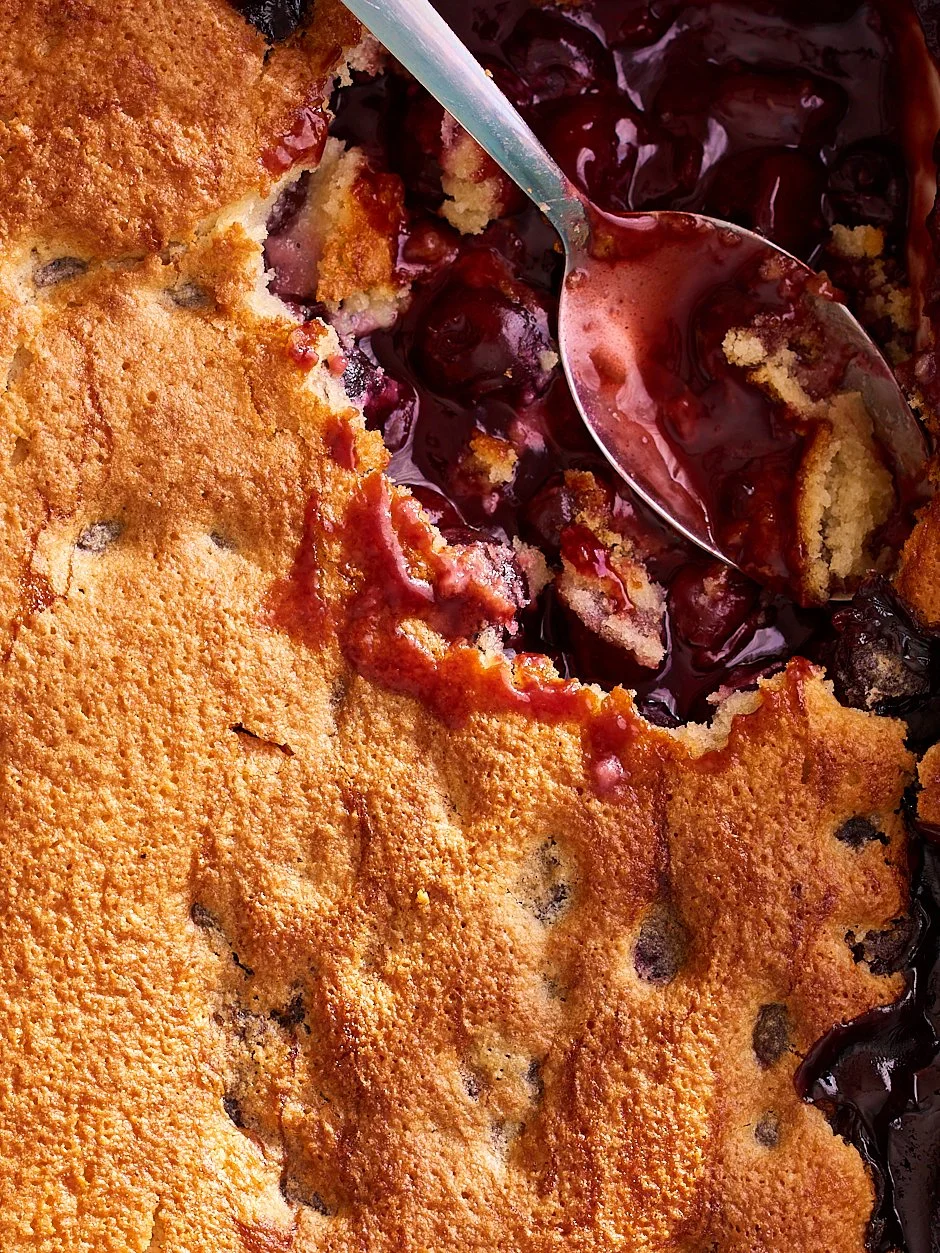
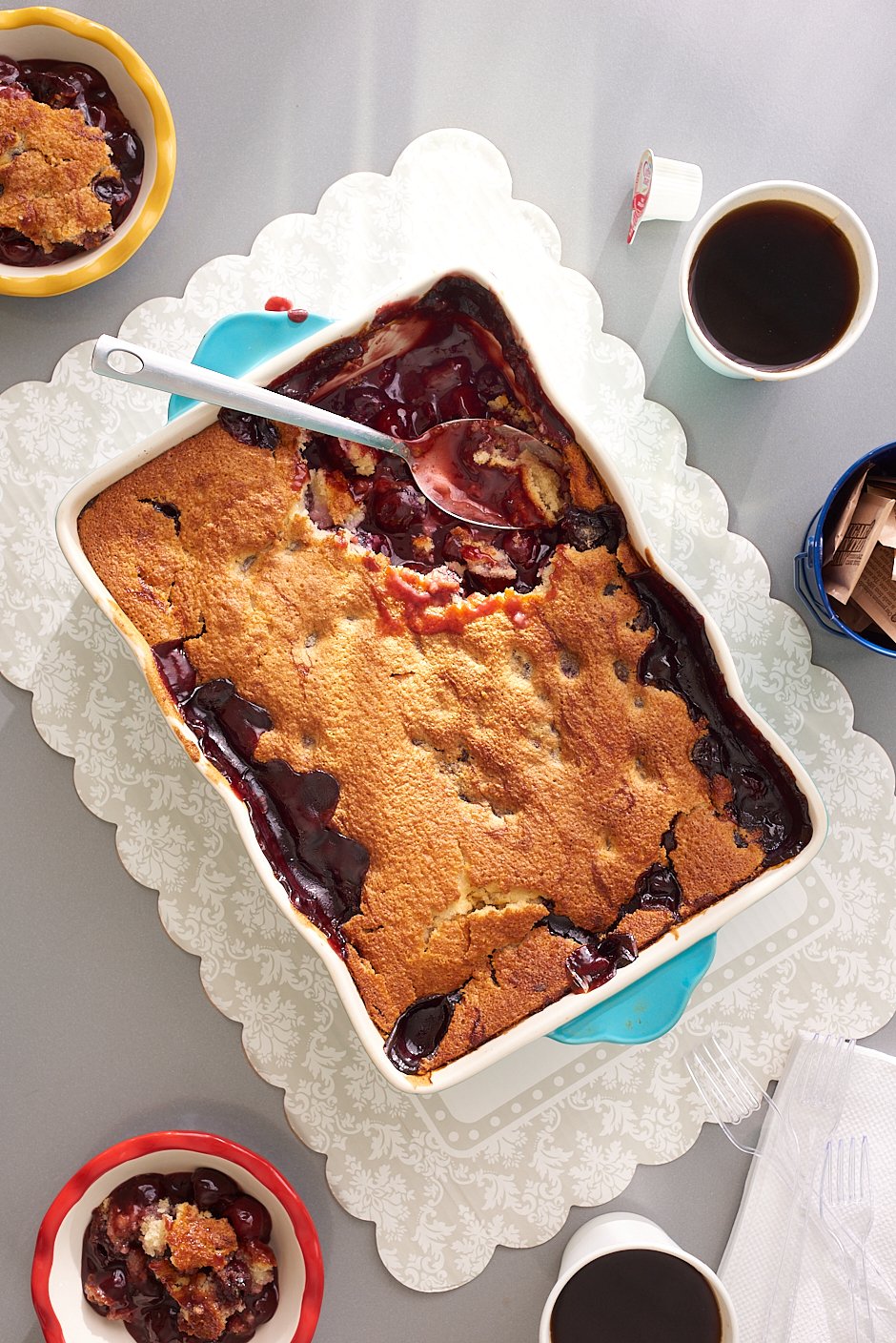
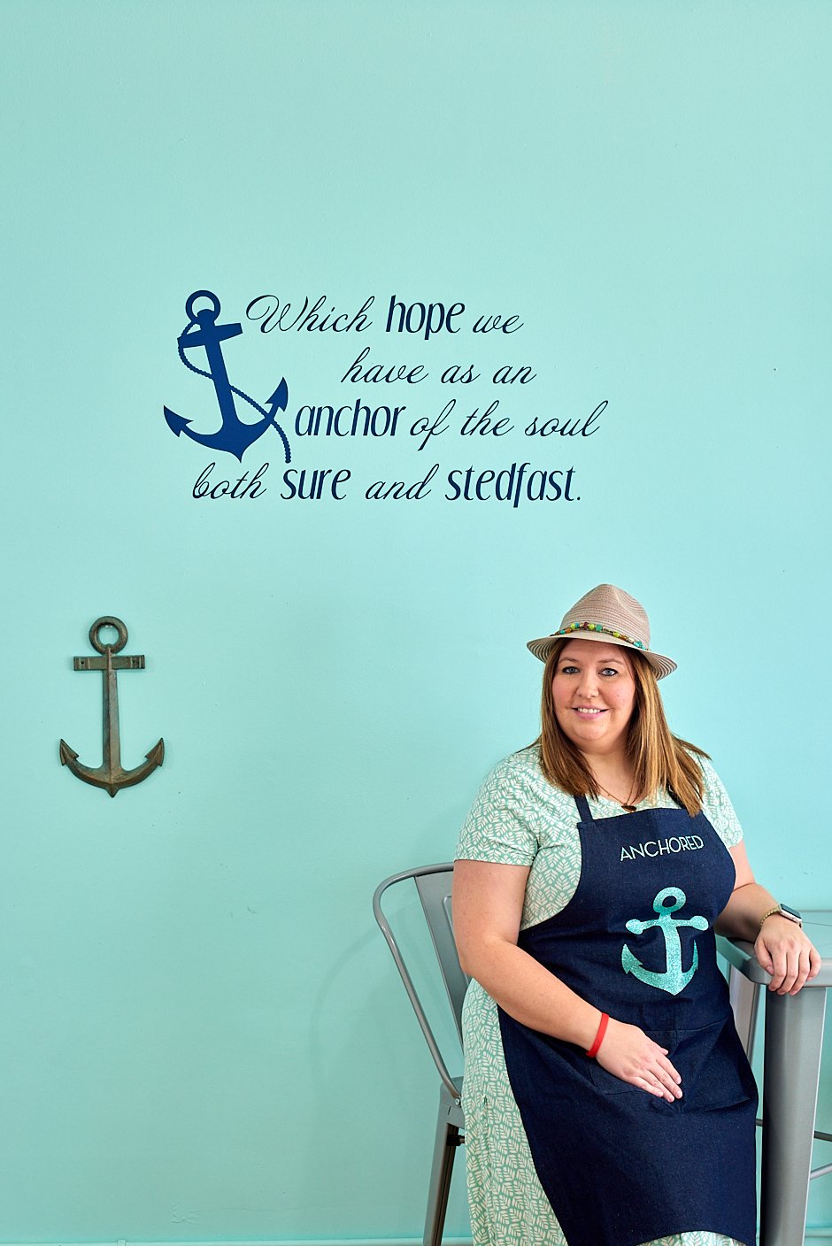
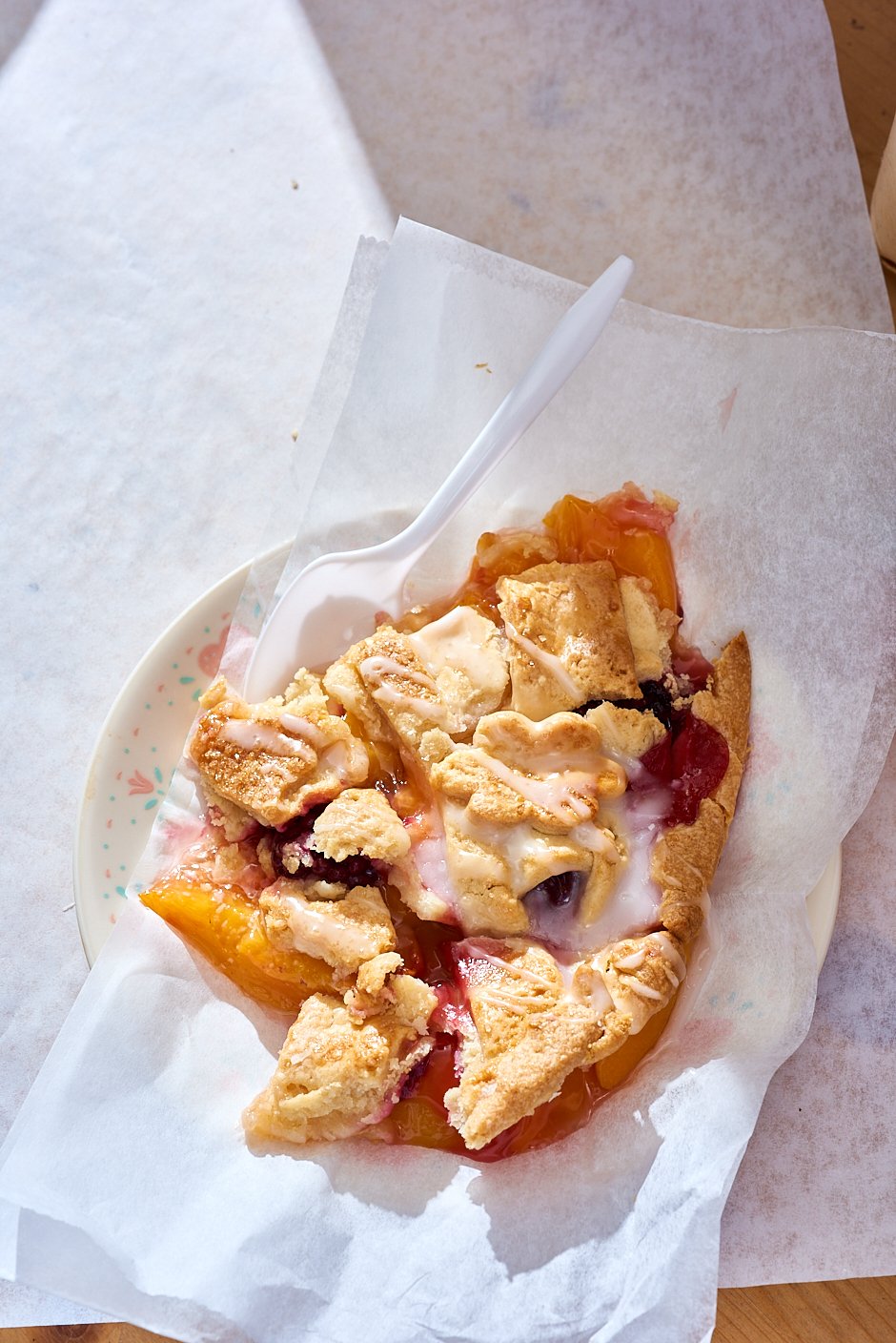
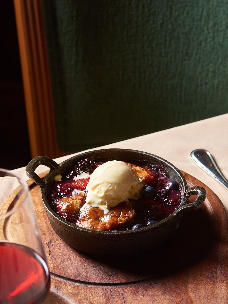
This shoot was produced for Our State Magazine, one of North Carolina's leading regional publications covering food, culture, and travel. On-location food and restaurant photography in working bakeries and restaurants presents different challenges than studio work — available light, active kitchen environments, and the need to capture both the food and the people behind it in a way that feels authentic rather than staged. The Sonker trail assignment required moving between three different locations in a single day while maintaining visual consistency across the story. Editorial food photography by Dhanraj Emanuel, based in Greensboro, NC and available nationwide for regional food publications, restaurant groups, and editorial clients.

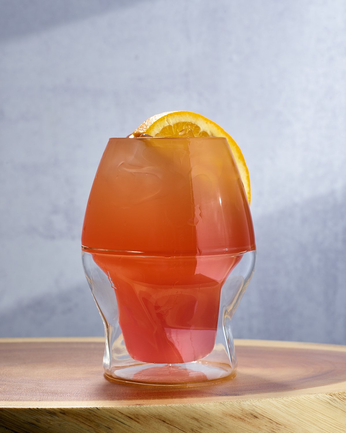
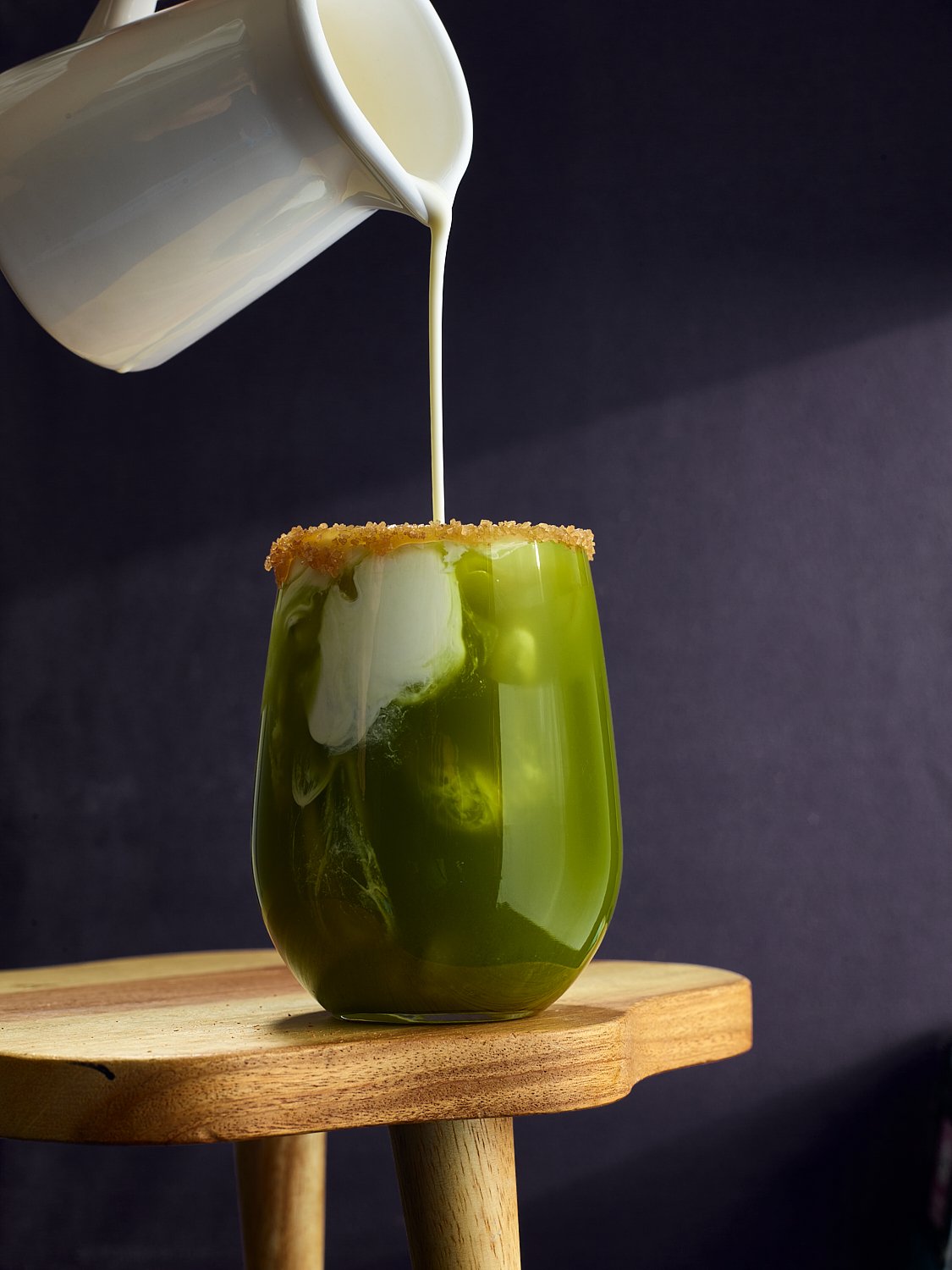
I want summer to stay
A summer food and lifestyle series celebrating the season's ease — bright spreads, rosé, and long light. Commercial food and beverage photographer Dhanraj Emanuel, available nationwide for seasonal campaigns and food brands.
Summer has a visual language that every food and beverage brand knows they need, and few get right. The brightness without harshness, the abundance without clutter, the ease that feels genuinely unforced. This series was built around capturing that feeling — the long light, the relaxed spread, the chilled glass that makes a viewer feel the temperature of the room.
Summer food and lifestyle photography is one of the most in-demand categories for food and beverage brands, grocery retailers, and hospitality clients planning seasonal campaigns. The challenge is always the same: make it feel like summer without making it feel like a stock photo. Every decision about color, light, and composition in this series was made with that tension in mind.


Summer food and beverage photography by Dhanraj Emanuel, studio-based in Greensboro, NC, available nationwide for food brands, grocery retailers, beverage companies, and advertising agencies seeking seasonal campaign imagery.